 Notification
 Newbie
38 posts
Newbie
38 posts
Create responsive projects in Adobe Captivate that scales seamlessly across devices and screen sizes. Use responsive projects to build an immersive learning experience for your learners and make learning interesting and interactive. In this document, you will learn to create and customize responsive projects in Adobe Captivate.
Assets and samples
The procedures in this document require you to use assets such as images and sample Adobe Captivate project files. You can choose to use your own assets and samples. However, it is recommended that you download and extract the following zip file to your computer:
create-responsive-projects.zip
Click to see the HTML preview of the completed project.
Create a responsive project
Let’s start by creating a responsive project in Adobe Captivate.
In the New tab on Adobe Captivate’s Welcome screen, choose Responsive Project and click Create.

Adobe Captivate creates a responsive project with a single slide.
In a responsive project in Adobe Captivate, the Preview bar above the slide gives you options to quickly view the project in different screen sizes or devices.
- To preview the project on different devices, select the desired Preview option in the drop-down list.
- The Preview Slider on the right side of the Preview bar allows you to resize the current slide and dynamically preview the contents.
As you move the slider left or right, the content in the slide gets adjusted to fit the screen.


Add Fluid Boxes to slides
You can also create responsive projects Adobe Captivate using Fluid Boxes layout. It provides the arrangement of objects on a slide so that the objects behave predictably when the slide accommodates different screen sizes and devices. A Fluid Box is an easy to use layout model for e-learning designers. You can lay out child objects in any direction and have the flexibility to adapt them according to the size of the display device.
A Fluid Box container expands the objects to fill available free space, or shrinks the objects to prevent overflow. Elements in a Fluid Box are direction-agnostic. The objects can adapt to the space available.
Let’s add a blank slide to our project and then use Fluid Boxes to aid the responsiveness of the slide. The slide at the end of this procedure appears as follows:

The above slide uses two horizontal Fluid Boxes.
- In the downloaded files folder, navigate to the samples subfolder and open:
create-responsive-projects.cptx
Note:It is not mandatory that you download the project file that ships with this tutorial. You can still follow along with the steps in this procedure. However, make sure that you create a responsive project in Adobe Captivate. - With the first slide in the Filmstrip selected, in the toolbar, click Slides, and choose Blank Slide.
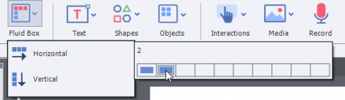
Let’s first add two horizontal Fluid Boxes to the current slide. - In the toolbar, click Fluid Box and choose Horizontal.
- In the submenu, choose the second box to add two horizontal Fluid Boxes.

When you put Fluid Boxes on a slide, the boxes are evenly spaced across the slide. The slider between them allows you to resize the box.

- Move the slider to the left to resize the horizontal boxes.
Next, place two vertical Fluid Boxes in the right horizontal box. - To place the object inside the right horizontal box, select the box.
- In the toolbar, click Fluid Box and choose Vertical.
- In the submenu, choose the second box to add two vertical Fluid Boxes.

- Move the slider up to resize the vertical boxes.

Test the responsiveness of this slide by moving the Preview Slider left and right.
Alternatively, pick the different devices from the Preview in drop-down list.
Add objects to Fluid Boxes
In the previous section, you learned how to add horizontal and vertical Fluid Boxes to a slide.
Let’s add objects to the Fluid Boxes on the slide.
Note:You cannot add rollover objects to Fluid Boxes because these objects don’t work on mobile devices.
The slide at the end of this procedure appears as follows:

- In the downloaded files folder, navigate to the samples subfolder and open:
create-responsive-projects-with-fluid.cptx
Note:It is not mandatory that you download the project file that ships with this tutorial. You can still follow along with the steps in this procedure. However, it is recommended that you create a slide similar to the slide displayed at the beginning of the above section. - Navigate to the slide that contains the horizontal and vertical Fluid Boxes.
- To add a text caption in the left horizontal box, select the box on the slide.
- In the toolbar, click Text and then choose Text Caption.
Enter the following text into the text caption box:
LUNARSPHERE STUDIOS
You can make formatting changes to the text using the Properties Inspector. To view the Properties Inspector, click Properties in the right corner of the toolbar. - To add a text caption in the lower right vertical horizontal box, select the box on the slide.
- In the toolbar, click Text and then choose Text Caption.
Copy and paste the following text into the text caption:
Madison and Robert are part of the Learning Team at Lunarsphere Studios. Just like you, each day they’re presented with new challenges and opportunities testing their skills and the limits of what’s possible. Today, you go on a journey as Madison and Robert, and use Adobe Captivate for the first time.
- To add an image in the upper right vertical box, select the box on the slide.
- Click Media in the toolbar and then choose Image.
A dialog box is displayed that allows you to select the image file from your computer. - In the downloaded files folder, navigate to the assets subfolder.
- Choose the file lunasphere-studios-team.png and open it.
The image is placed in the upper right vertical Fluid Box.
Notice how the image scales to fit the Fluid Box into which it is placed. - Test the responsiveness of this slide by moving the Preview Slider left and right.
Alternatively, pick the different devices from the Preview in drop-down list.
In the toolbar, click Preview and then choose Project.
To get to know more on Fluid Boxes, refer to Fluid Boxes in Adobe Captivate.
Add responsive simulations to projects
You can capture simulation steps in a responsive project in the following modes:
- Demo.
- Assessment.
- Training.
To record the steps to create PowerPoint presentation, insert a short software simulation in Demo mode.
- In the downloaded files folder, navigate to the samples subfolder and open:
create-responsive-projects.cptx - In the toolbar, click Slides and choose Software Simulation.
- In the Record Additional Slides dialog box, choose the slide after which you want to insert the software simulation and click OK.
- The dialog box provides you with the options to record the demo. Choose the following options:
In the drop-down list, choose PowerPoint.
In the Mode drop-down list, ensure that Demo mode is selected.
- Click Record.
After the counter counts down to 1, the PowerPoint application comes to the foreground. - Perform the following steps in PowerPoint:
- Select the File menu.
- Choose New.
- Choose a theme.
- In the dialog box, click Create
- To end your simulation:
On Windows, press the End key on your keyboard.
On MAC, click the Adobe Captivate icon in the top bar.

When you end your simulation, Adobe Captivate comes to the foreground again.
The Demo slides are inserted within your project.
The recorded slides are added to the Captivate project. Notice that there’s a blue rectangle on each of the simulation slides. The blue rectangle is the focus area of the simulation. It’s only visible in the editing area, and disappears when you preview or publish the project. Note that the size of this blue rectangle is the minimum supported device size for Captivate responsive projects.

Each slide of the simulation also contains a blue bounding box. This area of the slide is displayed for the minimum size device. You can move this box around the slide if you want to display a different area from what Adobe Captivate selected, by default.
In the toolbar, click Preview and then choose Project.
Add responsive quizzes to projects
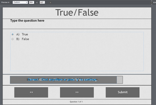
When you add a quiz slide to a responsive project, Adobe Captivate adds Fluid Boxes to ensure the responsiveness of the contents on the slide.
To try out this behavior, let’s create a simple quiz with a single True / False question.
- In the downloaded files folder, navigate to the samples subfolder and open:
create-responsive-projects.cptx
Note:It is not mandatory that you download the project file that ships with this tutorial. You can still follow along with the steps in this procedure. However, make sure that you create a responsive project in Adobe Captivate. - In the toolbar, click Slides and choose Question Slide.
- In the Insert Questions dialog box, select the True/False check-box and click OK.
A question slide is inserted after the slide title Summary.
Also, after the question slide, Adobe Captivate inserts a Quiz Results slide.
When you add a question slide to a responsive project, Adobe Captivate puts all the objects of the question into Fluid Boxes to ensure responsiveness: Also notice the Preview Slider options that allow you to quickly check the responsiveness of the slide.
 - In the question slide, enter the following question in the text area (overwriting the placeholder text):
You cannot create Responsive projects with Adobe Captivate.
In the choices, select False.
Let’s preview and try out the quiz question.
In the toolbar, click Preview and then choose Project.
 Also notice the Preview Slider options that allow you to quickly check the responsiveness of the slide.
Convert non-responsive projects to responsive
If you have an Adobe Captivate project that is not responsive, Adobe Captivate provides you with a simple method to convert your project to a responsive project.
Let’s take a non-responsive project and convert it to a responsive project.
Before converting the project, let’s preview how this project looks.
In the toolbar, open Preview and then choose Project.
- In the downloaded files folder, navigate to the samples subfolder and open:
non-responsive-project.cptx
Note:It is not mandatory that you download the project file that ships with this tutorial. You can still follow along with the steps in this procedure. However, make sure that you create a responsive project in Adobe Captivate.
Notice that the Preview Slider that is displayed above the slides in a responsive project is not displayed above slides in a non-responsive project. That’s a useful visual cue to check if a project is responsive or not. - In the File menu, choose Save As Responsive.
Since all Adobe Captivate objects are not supported in responsive projects, the following dialog box is displayed:

- Click Show Unsupported Items.

The HTML5 Tracker panel displays the list of unsupported objects and slides. - Click open the unsupported object in the panel.
You are taken to the slide containing the object. Also, the object is selected on the slide.
If, for example, a user views the output on mobile devices, your project must not include rollover objects. - Delete the selected rollover caption from the slide.
Notice that the object is now not displayed in the HTML5 Tracker panel. - After you have removed the unsupported objects, from the File menu, choose Save As Responsive.
- In the dialog box, click Save.
- In the Save As dialog box, choose a file location on your computer and filename for the newly converted responsive project.
Notice that the Preview Slider is now displayed above the slides in the converted project.
After converting the project, let’s preview how the newly converted responsive project looks.
In the toolbar, click Preview and then choose Project.


Assets and samples
The procedures in this document require you to use assets such as images and sample Adobe Captivate project files. You can choose to use your own assets and samples. However, it is recommended that you download and extract the following zip file to your computer:
create-responsive-projects.zip
Click to see the HTML preview of the completed project.
Create a responsive project
Let’s start by creating a responsive project in Adobe Captivate.
In the New tab on Adobe Captivate’s Welcome screen, choose Responsive Project and click Create.
Adobe Captivate creates a responsive project with a single slide.
In a responsive project in Adobe Captivate, the Preview bar above the slide gives you options to quickly view the project in different screen sizes or devices.
- To preview the project on different devices, select the desired Preview option in the drop-down list.
- The Preview Slider on the right side of the Preview bar allows you to resize the current slide and dynamically preview the contents.
As you move the slider left or right, the content in the slide gets adjusted to fit the screen.
Add Fluid Boxes to slides
You can also create responsive projects Adobe Captivate using Fluid Boxes layout. It provides the arrangement of objects on a slide so that the objects behave predictably when the slide accommodates different screen sizes and devices. A Fluid Box is an easy to use layout model for e-learning designers. You can lay out child objects in any direction and have the flexibility to adapt them according to the size of the display device.
A Fluid Box container expands the objects to fill available free space, or shrinks the objects to prevent overflow. Elements in a Fluid Box are direction-agnostic. The objects can adapt to the space available.
Let’s add a blank slide to our project and then use Fluid Boxes to aid the responsiveness of the slide. The slide at the end of this procedure appears as follows:
The above slide uses two horizontal Fluid Boxes.
- In the downloaded files folder, navigate to the samples subfolder and open:
create-responsive-projects.cptx
Note:It is not mandatory that you download the project file that ships with this tutorial. You can still follow along with the steps in this procedure. However, make sure that you create a responsive project in Adobe Captivate. - With the first slide in the Filmstrip selected, in the toolbar, click Slides, and choose Blank Slide.
Let’s first add two horizontal Fluid Boxes to the current slide. - In the toolbar, click Fluid Box and choose Horizontal.
- In the submenu, choose the second box to add two horizontal Fluid Boxes.
When you put Fluid Boxes on a slide, the boxes are evenly spaced across the slide. The slider between them allows you to resize the box.
- Move the slider to the left to resize the horizontal boxes.
Next, place two vertical Fluid Boxes in the right horizontal box. - To place the object inside the right horizontal box, select the box.
- In the toolbar, click Fluid Box and choose Vertical.
- In the submenu, choose the second box to add two vertical Fluid Boxes.
- Move the slider up to resize the vertical boxes.
Test the responsiveness of this slide by moving the Preview Slider left and right.
Alternatively, pick the different devices from the Preview in drop-down list.
Add objects to Fluid Boxes
In the previous section, you learned how to add horizontal and vertical Fluid Boxes to a slide.
Let’s add objects to the Fluid Boxes on the slide.
Note:You cannot add rollover objects to Fluid Boxes because these objects don’t work on mobile devices.
The slide at the end of this procedure appears as follows:
- In the downloaded files folder, navigate to the samples subfolder and open:
create-responsive-projects-with-fluid.cptx
Note:It is not mandatory that you download the project file that ships with this tutorial. You can still follow along with the steps in this procedure. However, it is recommended that you create a slide similar to the slide displayed at the beginning of the above section. - Navigate to the slide that contains the horizontal and vertical Fluid Boxes.
- To add a text caption in the left horizontal box, select the box on the slide.
- In the toolbar, click Text and then choose Text Caption.
Enter the following text into the text caption box:
LUNARSPHERE STUDIOS
You can make formatting changes to the text using the Properties Inspector. To view the Properties Inspector, click Properties in the right corner of the toolbar. - To add a text caption in the lower right vertical horizontal box, select the box on the slide.
- In the toolbar, click Text and then choose Text Caption.
Copy and paste the following text into the text caption:
Madison and Robert are part of the Learning Team at Lunarsphere Studios. Just like you, each day they’re presented with new challenges and opportunities testing their skills and the limits of what’s possible. Today, you go on a journey as Madison and Robert, and use Adobe Captivate for the first time.
- To add an image in the upper right vertical box, select the box on the slide.
- Click Media in the toolbar and then choose Image.
A dialog box is displayed that allows you to select the image file from your computer. - In the downloaded files folder, navigate to the assets subfolder.
- Choose the file lunasphere-studios-team.png and open it.
The image is placed in the upper right vertical Fluid Box.
Notice how the image scales to fit the Fluid Box into which it is placed. - Test the responsiveness of this slide by moving the Preview Slider left and right.
Alternatively, pick the different devices from the Preview in drop-down list.
In the toolbar, click Preview and then choose Project.
To get to know more on Fluid Boxes, refer to Fluid Boxes in Adobe Captivate.
Add responsive simulations to projects
You can capture simulation steps in a responsive project in the following modes:
- Demo.
- Assessment.
- Training.
To record the steps to create PowerPoint presentation, insert a short software simulation in Demo mode.
- In the downloaded files folder, navigate to the samples subfolder and open:
create-responsive-projects.cptx - In the toolbar, click Slides and choose Software Simulation.
- In the Record Additional Slides dialog box, choose the slide after which you want to insert the software simulation and click OK.
- The dialog box provides you with the options to record the demo. Choose the following options:
In the drop-down list, choose PowerPoint.
In the Mode drop-down list, ensure that Demo mode is selected. - Click Record.
After the counter counts down to 1, the PowerPoint application comes to the foreground. - Perform the following steps in PowerPoint:
- Select the File menu.
- Choose New.
- Choose a theme.
- In the dialog box, click Create
- To end your simulation:
On Windows, press the End key on your keyboard.
On MAC, click the Adobe Captivate icon in the top bar.
When you end your simulation, Adobe Captivate comes to the foreground again.
The Demo slides are inserted within your project.
The recorded slides are added to the Captivate project. Notice that there’s a blue rectangle on each of the simulation slides. The blue rectangle is the focus area of the simulation. It’s only visible in the editing area, and disappears when you preview or publish the project. Note that the size of this blue rectangle is the minimum supported device size for Captivate responsive projects.
Each slide of the simulation also contains a blue bounding box. This area of the slide is displayed for the minimum size device. You can move this box around the slide if you want to display a different area from what Adobe Captivate selected, by default.
In the toolbar, click Preview and then choose Project.
Add responsive quizzes to projects
When you add a quiz slide to a responsive project, Adobe Captivate adds Fluid Boxes to ensure the responsiveness of the contents on the slide.
To try out this behavior, let’s create a simple quiz with a single True / False question.
- In the downloaded files folder, navigate to the samples subfolder and open:
create-responsive-projects.cptx
Note:It is not mandatory that you download the project file that ships with this tutorial. You can still follow along with the steps in this procedure. However, make sure that you create a responsive project in Adobe Captivate. - In the toolbar, click Slides and choose Question Slide.
- In the Insert Questions dialog box, select the True/False check-box and click OK.
A question slide is inserted after the slide title Summary.
Also, after the question slide, Adobe Captivate inserts a Quiz Results slide.
When you add a question slide to a responsive project, Adobe Captivate puts all the objects of the question into Fluid Boxes to ensure responsiveness:Also notice the Preview Slider options that allow you to quickly check the responsiveness of the slide. - In the question slide, enter the following question in the text area (overwriting the placeholder text):
You cannot create Responsive projects with Adobe Captivate.
In the choices, select False.
Let’s preview and try out the quiz question.
In the toolbar, click Preview and then choose Project.
Convert non-responsive projects to responsive
If you have an Adobe Captivate project that is not responsive, Adobe Captivate provides you with a simple method to convert your project to a responsive project.
Let’s take a non-responsive project and convert it to a responsive project.
Before converting the project, let’s preview how this project looks.
In the toolbar, open Preview and then choose Project.
- In the downloaded files folder, navigate to the samples subfolder and open:
non-responsive-project.cptx
Note:It is not mandatory that you download the project file that ships with this tutorial. You can still follow along with the steps in this procedure. However, make sure that you create a responsive project in Adobe Captivate.
Notice that the Preview Slider that is displayed above the slides in a responsive project is not displayed above slides in a non-responsive project. That’s a useful visual cue to check if a project is responsive or not. - In the File menu, choose Save As Responsive.
Since all Adobe Captivate objects are not supported in responsive projects, the following dialog box is displayed:
- Click Show Unsupported Items.
The HTML5 Tracker panel displays the list of unsupported objects and slides. - Click open the unsupported object in the panel.
You are taken to the slide containing the object. Also, the object is selected on the slide.
If, for example, a user views the output on mobile devices, your project must not include rollover objects. - Delete the selected rollover caption from the slide.
Notice that the object is now not displayed in the HTML5 Tracker panel. - After you have removed the unsupported objects, from the File menu, choose Save As Responsive.
- In the dialog box, click Save.
- In the Save As dialog box, choose a file location on your computer and filename for the newly converted responsive project.
Notice that the Preview Slider is now displayed above the slides in the converted project.
After converting the project, let’s preview how the newly converted responsive project looks.
In the toolbar, click Preview and then choose Project.
You must be logged in to post a comment.
- Most Recent
- Most Relevant
In this session, you will explore using this approach as an alternative to managing multiple Captivate projects. A responsive project will always start with a Fluid Boxes, where you can use a packaged or custom theme.
For me it is very difficult to size pictures I put in fluid boxes. Any Ideas what the problem might be?
Default setup for fluid boxes is to stretch vertically and horizontally. Try deactivating those options and see if you can resize pictures more easily.
My impression of fluid boxes is that if you go too far ( I mean if the layout is too complex) the things might be difficult to control. Generally, I would say it is good for relatively simple projects. In such a case fluid boxes do a lot of work for you. If you overdo, you may achieve the opposite effect.
Agree at least partially. For more complex layout you should revert to Breakpoint views workflow if you really need a responsive project. Too bad that this workflow has been almost hidden by the Captivate developers. It is a lot more work, but offers all the control you need for such layout.
That made things seem a lot more simplified and it will be something I look into in the future.
Very useful information, I have avoided projects using fluid boxes but I do feel a bit more comfortable giving it a try after reading this article.
Very useful guide, thank you
Thank you for the information you have shared. I tried it out and like what I see. I recorded a software simulation as a responsive project. The blue square moves great. In iPad view, I would like to keep the left part of the screen visible to the left edge of the simulation, not the left edge of the blue box for phones. Is there a setting where I can change this?
Thank you! very helpful for a newbie like me!
I am trying to publish a responsive project in a full-screen mode. Is there some trick, to write JavaScript, or to chose the bigger resolution and resize project before publishing?
No, you should have chosen a bigger resolution (custom) to start with. In Fluid Boxes projects you lose some control as developer. Did you really need a responsive project, since you talk about big screens? Why not use scalable HTML output in that case?
Thank you for posting this. It helped to clear up Fluid Boxes for me. I especially like the explanation of the bounding box in a software simulation.
Very helpful in helping to learn beyond the basics of using fluid boxes. Gonna have so much fun this summer.
So, can I assume breakpoints are the old way of doing a responsive design?
certainly… Because, Captivate itself is not giving any option directly to build the project using breakpoint (only way given is, convert Fluidbox project to Break-point mode.) That is a hint to us that in a future version, they may stop the “Break-point mode” all to gather.
I don’t agree that Breakpoints are an ‘old’ way of creating responsive projects. In my mind it is the ONLY way to have a full responsive project. Only that workflow allows you to replace more complicated assets (which lead to bigger file size) by other assets if the course is viewed on smaller devices which have not only a lower browser resolution but more limited hardware and maybe bandwidth.
I strongly plead with the Captivate team to abandon never the Breakpoint views workflow, a feature which the concurrent tools do not have. Fluid Boxes take less time for development but besides what I mentioned already they do have a lot of limitations for the developer: several type of items cannot be used, stacking is forbidden in normal fluid boxes, you cannot use the main master slide, you cannot group assets, you cannot display items for the rest of the project etc….
Fluid Boxes are an intermediate solution, more responsive than rescalable HTML5 output, but lot more limited than Breakpoints.
Will post link to my comparison in a separate comment (moderation). It was created for CP2017, but only the UI has changed for fluid boxes, limitations were not taken away.
Here is the link to the comparative blog, which has also two short examples as illustration:
Is Captivate made using HTML, CSS and Javascript?
Published output to HTML5 is indeed using HTML, CSS and JS (inclusing JSON). That is however not the same as the application itself, maybe I misunderstand your question? Can you give some more details? Also why you post this question in a thread about responsive projects with Fluid Boxes.
Save as Responsive is grayed out in Captivate 2019
Save as responsive project is only available for old non-responsive projects you want to upgrade. Have to warn you: that will only work with very simple projects, personally I never did see a result that was acceptable for any of my projects.
If you started a non-responsive project in CP2019, you cannot save is as a responsive project.
really appreciable work …but I think you must not mix many things together. Instead of that, one complete real-life example of/on the Responsive project would be of great help. Whenever we search any tutorial on any captivate topic, we get 100’s of basic tutorial but not a single tutorial showing real-life output.
sorry for my negative thought…
No. unfortunatly not. But just now i visited. It is realy realy having tons of good information. I am sorry if I have hurt you or to any other for that matter. My aim was on broad level search… either in google or on youtube …
I didn’t count the number of hours I spent writing all those articles since almost 10 years, nor why Google is now banning me. It is weird, very old articles are well visited, recent ones not.
As a former professor (university college) I don’t believe that YouTube offers the best resources. There is no curation, lot of incorrect or incomplete videos. Good videos and interactive videos can be part of learning assets, but the way they are now used as only resource is leading to a lot of bad practice as I see daily in thise forums, during training sessions and in consultancy jobs.
Thanks for the article
The Save as Responsive option is not available in 2019 – where is it?
I like the tutorial. Thank you.
Thanks for the article on Fluid Boxes and also your Youtube video on the subject. Your articles and videos have really helped in “getting up to speed” on the responsive workflow in Captivate 2017.
Thanks for the article. I only have a doubt, is it normal that announcement with big letters get out of the image when it is displayed in the narrowest view?
How did you test, please? You need to test in browser, not in the editing environment.
Nice explanation. I think with the help of this article anyone can create a responsive project. Thanks for sharing…
Thanks for editing the title!
Thank you, Lieve. Please keep the comments coming.
Not yet fed up with all my comments? 😉
Not at all, Lieve. Your comments will only help improve the content quality by several notches.
TItle should have been ‘Responsive project with Fluid Boxes workflow’. There is another workflow, Breakpoint Views for responsive projects, which is more time consuming but the only workflow that gives you full control over the changes in layout when smaller browser resolutions are used. Not all projects are suited for the Fluid Boxes workflow, as you can see from many questions on the forum.
