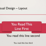
Visual Design aims to build on improving the user experience through illustrations, photography, fonts, space, layout and colours. However, most people working in the eLearning field do not have formal training as a graphic designer. How do you improve the user experience through Visual Design?
This stimulating lighthearted session will show you some simple techniques to help make you visually literate. Your screens will pop when you follow some of the tips provided to you. We will look at some tips to build screens that will not only look great but can be used to improve retention. We will also outline some resources and how to get collect resources that can inspire your creative juices.
Redirecting to Adobe Community login...
You must be logged in to post a comment.
- Most Recent
- Most Relevant
I have never understood why people care so much about looks but I know they do. I never understood why people would pay more for a pink or a blue laptop but they do. Thus, I have to make my own courses look good. However, I am not sure if I can learn how to do that. I have tried but all my designs look terrible. The more I work on them the worst they look. I am now trying to use templates but they are never perfect for me. However, every change I make to them makes them look more like my own designs. Can we learn aesthetics?
If you click on the “Watch Now” button above, you will find the pre-recorded session. I apologise again about the audio. It worked well when we tested the connection last week. Mind you there was no else in the room and there wan’t a thunderstorm outside my door. Thank you for investing your time and participating in the workshop.
I watched the pre-recorded resource and loved it.
I felt however that there was too much to cover in the live session and very little to no opportunity to ask questions and have the presenter respond real time.
The content was very relevant and Phil was obviously an expert in the field.
I really enjoyed the content and learned a lot, but when watching live the audio was dreadful. There were comments made in the Q&A panel and Adobe said they were working to fix it, but the presenter wasn’t alerted until the break so there were 45 minutes of cutting out audio. The second half wasn’t any better and still it wasn’t paused to see if it could be fixed. It is a shame as the speaker was really interesting and informative but I was struggling to understand some bits as so many words cut out.
Thank you so much for your comments. I am really sorry that the audio had cut out so much. When I’m sharing my screen, I can’t see any of the information within Connect so I didn’t know there was an issue. When we did the test run, all went well. However with thousands of people on the Adobe Connect site and a thunderstorm out my door, there’s lots that could go wrong. You can check out the pre-recorded video to hear what was dropped and see some parts that we didn’t have time to cover.
Cheers
In case you are not able to access the primary site https://elearning.adobe.com/elearning_world/ you can find the session on our backup site https://elearningworld.adobeconnect.com/sessions/. Inconvenience caused is regretted.
Wayne,
Bookmark this backup site. It has the links from a separate server. https://elearningworld.adobeconnect.com/sessions/
Allen


