Close

Search

Adobe Captivate (2019 release) and Automatic device preview
August 22, 2018
7
0

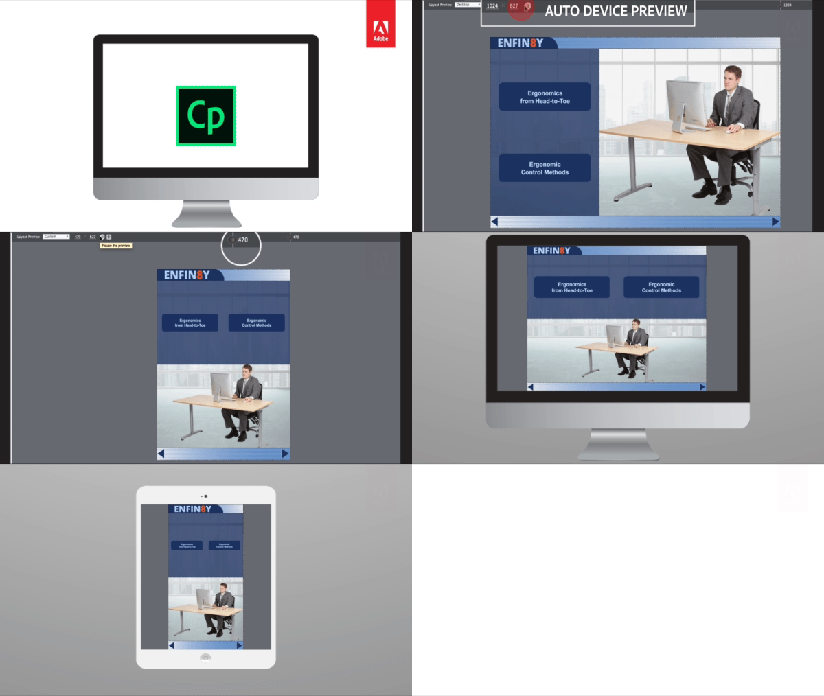
 Hit the play button to see your content automatically change shape and form factor across the full spectrum of device sizes in responsive courses created using Adobe Captivate. Get a holistic view of how responsive your content is on every screen size.
Steps:
- Launch Adobe Captivate 2019.
- On the Welcome screen, under New tab, double-click Responsive Project thumbnail to create a new responsive project.

- On the Toolbar, click Themes, and select the Coastal theme to apply it to the project.

- Click Yes to apply the new theme.
- Click the Properties icon on the top-right corner.
- Click the arrow next to the Master Slide thumbnail.

- From the list of Master slides, select the Title thumbnail.

- Click the Layout Preview button to see your content automatically wrap, scale and align across device sizes.

- You can also use the same option in the Wrap properties. Change the wrap property for the Fluid Box and click the Layout Preview button to check out the new wrapping behavior.

Watch this video to learn more about this feature in Adobe Captivate (2019 release):

 Hit the play button to see your content automatically change shape and form factor across the full spectrum of device sizes in responsive courses created using Adobe Captivate. Get a holistic view of how responsive your content is on every screen size.
Steps:
- Launch Adobe Captivate 2019.
- On the Welcome screen, under New tab, double-click Responsive Project thumbnail to create a new responsive project.

- On the Toolbar, click Themes, and select the Coastal theme to apply it to the project.

- Click Yes to apply the new theme.
- Click the Properties icon on the top-right corner.
- Click the arrow next to the Master Slide thumbnail.

- From the list of Master slides, select the Title thumbnail.

- Click the Layout Preview button to see your content automatically wrap, scale and align across device sizes.

- You can also use the same option in the Wrap properties. Change the wrap property for the Fluid Box and click the Layout Preview button to check out the new wrapping behavior.

Watch this video to learn more about this feature in Adobe Captivate (2019 release):
You must be logged in to post a comment.
All Comments
Sort by:
Most Recent 
- Most Recent
- Most Relevant


