 Newbie
How to maintain vertical alignment of text, buttons and cards in the all-new Captivate
Hi everyone,
Please help me understand why I can’t maintain vertical alignment of text, buttons, cards etc
In the screenshot, I have done the following:

Created a New project
Added the Image media block to the slide
Changed the design option to: Introduction slide single image option 2. The text and button look vertically aligned, great.
When I change the Caption text to ‘Welcome‘, the text and button move up, as seen in the second screenshot – a smaller space at the top and a bigger space at the bottom.

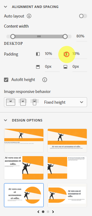
Settings:
How can I keep the text and button vertically centred?
There are many examples slides in the Assets provided that work fine, I just can’t replicate it.
Can anyone suggest what I need to change?
Hi everyone,
Please help me understand why I can’t maintain vertical alignment of text, buttons, cards etc
In the screenshot, I have done the following:
Created a New project
Added the Image media block to the slide
Changed the design option to: Introduction slide single image option 2. The text and button look vertically aligned, great.
When I change the Caption text to ‘Welcome‘, the text and button move up, as seen in the second screenshot – a smaller space at the top and a bigger space at the bottom.
Settings:
How can I keep the text and button vertically centred?
There are many examples slides in the Assets provided that work fine, I just can’t replicate it.
Can anyone suggest what I need to change?


You must be logged in to post a comment.
- Most Recent
- Most Relevant
Hello,
I have sent an email regarding the issue. Please reply to that email so that I can assist you accordingly.
Here to help,
Adobe Captivate Support
