 There’s a lot of focus on quickly creating great looking content in the new Adobe Captivate 5.5. In this post I’ll take a quick look at how you can work with objects on layers to create professional looking eLearning pages quickly and easily by taking advantage of these new features.
I’ve added a new “What’s That?” video to help you see the steps involved in this process, and like the other “What’s That?” videos – i’ve used the new direct to YouTube feature to export HD videos straight to YouTube. So when you watch it toggle the video to full screen. If you haven’t seen it before, the quality at full screen is amazing – and really changes what we can do with software demos this way.
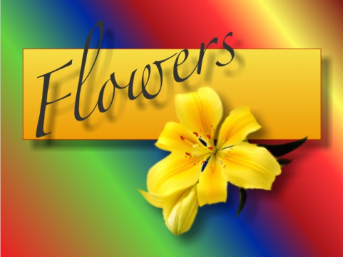
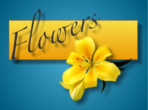
So how might you leverage these new tools to help you create better richer content? Well, first and foremost – remember to keep your pages simple. The most common problem with the design of eLearning pages, is that people try to put way too much content on a single page. Try to stick to just a few ideas on a given page, and be careful not to let the background compete with the content on the page. Sure, I know you’re proud of that cool gradient background, but it only works if it’s subtle enough to look interesting without pulling the learners attention away from the learning content. Look at these examples below – can you identify the one that works the best?
This first image we’ll call gradient’s gone amuck. See how those colors in the background are sort of competing with the text and image? In general backgrounds should blend and converge with your overall page, and they should remain subtle contributors. Adding a little complexity to the look with a gradient can be awesome, but this color crazy approach is almost never appropriate. Try to take a more subtle approach and avoid overcomplicating the gradients.
Now the above image is significantly better. It’s still not quite perfect, but let’s call it an okay solution, if not ideal in all cases. This image uses very high contrast between colors. Notice how the blue and the yellow seem to almost be opposites? Those colors complement each other because they are opposite one another on the color wheel. This can be very useful if you want to create an image that has a lot of contrast – generally when communicating ideas that are strong or severe. Think of this as using a machete to cut the grass. Sometimes it might work well – after all, some grass is incredibly difficult to get through, but often we are not traversing the jungle, and the machete is overkill.
This final version takes a little bit more into account. Note that we still have gradients, but their use is subtle and echos both the colors of the image and the ‘meaning’ of the content. There is a story in everything, because people make meaning out of everything. Flowers are soft and gentle – so it only stands to reason that the page should echo this overall tone. The color contrast here is called analogous, it means that the colors are near one another on a color wheel.
Also notice that here the font color is changed to fall into line in the analogous color palette. This is careful work, as you need to keep in mind that you may have learners with difficulty seeing, so you want to avoid contrasts that are so pale they become difficult to discern for individuals with limited vision.
One last hot tip as it relates to working with gradients in Adobe Captivate 5.5. There’s an awesome tool available in the right click menu or via shortcut (SHIFT CMD G or SHIFT CTRL G) exposes the angle of gradient / length of gradient tool that will allow you to move the center, lengthen or shorten and adjust the angle of any gradient fill. Use this in combination with the linear or circular gradient buttons to get really precise control over the look and feel of fills.


