 Notification
 Newbie
8 posts
Newbie
8 posts
If you’ve been on the eLearning forums after the launch of Captivate 2017, you’ve already seen that you can convert an existing ‘blank,’ or standard, Cp project to Responsive bu choosing ‘Save as Responsive‘ in the File menu.
Now we’ll take a look at creating a customized preview mode for a Responsive project.
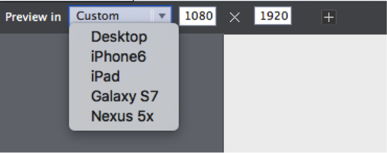
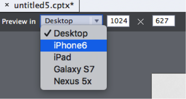
Once you have a responsive project open, if you look in the upper left corner of the project window there is a ‘Preview in’ dropdown menu and height and width boxes for width and height.
The default devices include: Desktop, iPhone 6, iPad, Galaxy S7, and Nexus 5x.
Selecting from these defaults will replace the sizes displayed in the width and height boxes, and resize the stage for that device.
Creating a temporary custom preview mode:
Editing the width or height fields will result in the dropdown menu showing “Custom” with the current project dimensions.
Note that this is also how the dimensions will appear for a project that has just be converted to a Responsive project.
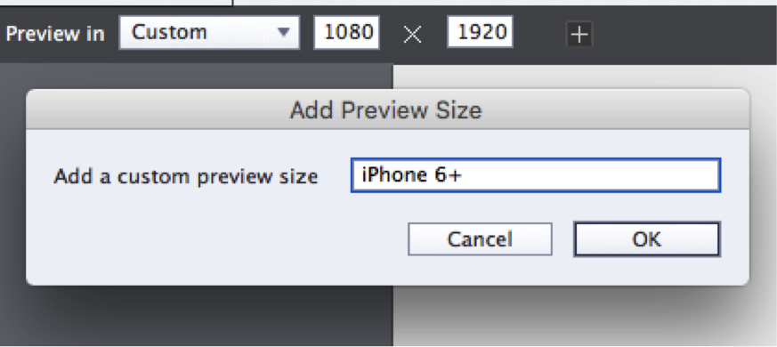
If you click the plus sign, you will be prompted to name this temporary custom size.
The menu will update showing your temporary custom size.
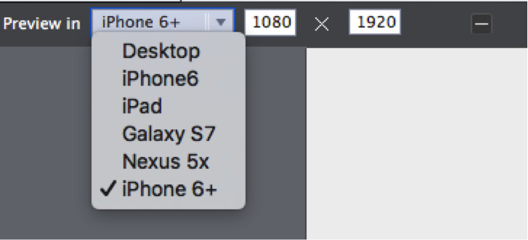
This size, but not the name, will be saved with the current project in the .cptx file, and will reload when you open this file.
It will not be an option for any new Responsive project files, you will need to remember to resize each project as it is created.
So, what if you want to make that size permanent?
Permanently editing the preview modes:
To permanently edit the preview modes, you can edit a text file to make the changes permanent. All you need to do is copy a line, paste it in as a new line, and edit the name, width and height.
Before continuing, it is best if you save and close any Captivate projects and exit the Captivate application before editing the file.
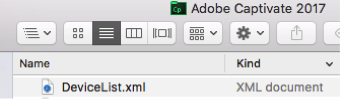
The DeviceList.xml file is a text file that meets specific standards for XML (eXtensible Markup Language) and is saved with the .XML extension.
You can find this file in a specific location, depending on your operating system:
Windows: Program Files/Adobe/Adobe Captivate 2017 x64/DeviceList.xml.
Macintosh: /Applications/Adobe Captivate 2017/DeviceList.xml.
Once you’ve located the correct file, you can open this file in Notepad (on Windows) and in TextEdit (on the Macintosh).
(Be careful about using a word processor, like MS Word, as they will add formatting as special hidden codes that will cause issues.)
You should make a copy as a first step, mark it as the original by adding _ORIG before .xml and leave that copy unchanged.
(Be sure that the file ends in “.XML” or you will not see any changes when you restart Adobe Captivate 2017
First, do you notice the structure of the XML file?
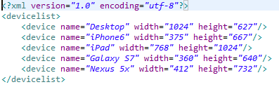
XML is all about structure!
The first line begins with “<?XML” and ends with “?>”
The second line is simply “<devicelist>” and the last line is “</devicelist>.”
Leave those lines as they are and copy the 2nd to last line:
<device name=”Nexus 5x” width=”412″ height=”732”/>
Move the cursor in front of the final line, and paste. You may need to add a return to ensure “</devicelist>” is the final line.
Your file should have these last three lines:
<device name=”Nexus 5x” width=”412″ height=”732″/>
<device name=”Nexus 5x” width=”412″ height=”732”/>
</devicelist>
Edit the last ‘device’ line so that it appears as such:
<device name=”iPhone 6+” width=”1080″ height=”1920″/>
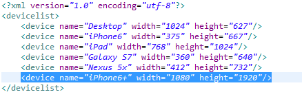
Once you’ve made these changes, save the file and relaunch Captivate 2017.
If you’ve been on the eLearning forums after the launch of Captivate 2017, you’ve already seen that you can convert an existing ‘blank,’ or standard, Cp project to Responsive bu choosing ‘Save as Responsive‘ in the File menu.
Now we’ll take a look at creating a customized preview mode for a Responsive project.
Once you have a responsive project open, if you look in the upper left corner of the project window there is a ‘Preview in’ dropdown menu and height and width boxes for width and height.
The default devices include: Desktop, iPhone 6, iPad, Galaxy S7, and Nexus 5x.
Selecting from these defaults will replace the sizes displayed in the width and height boxes, and resize the stage for that device.
Creating a temporary custom preview mode:
Editing the width or height fields will result in the dropdown menu showing “Custom” with the current project dimensions.
Note that this is also how the dimensions will appear for a project that has just be converted to a Responsive project.
If you click the plus sign, you will be prompted to name this temporary custom size.
The menu will update showing your temporary custom size.
This size, but not the name, will be saved with the current project in the .cptx file, and will reload when you open this file.
It will not be an option for any new Responsive project files, you will need to remember to resize each project as it is created.
So, what if you want to make that size permanent?
Permanently editing the preview modes:
To permanently edit the preview modes, you can edit a text file to make the changes permanent. All you need to do is copy a line, paste it in as a new line, and edit the name, width and height.
Before continuing, it is best if you save and close any Captivate projects and exit the Captivate application before editing the file.
The DeviceList.xml file is a text file that meets specific standards for XML (eXtensible Markup Language) and is saved with the .XML extension.
You can find this file in a specific location, depending on your operating system:
Windows: Program Files/Adobe/Adobe Captivate 2017 x64/DeviceList.xml.
Macintosh: /Applications/Adobe Captivate 2017/DeviceList.xml.
Once you’ve located the correct file, you can open this file in Notepad (on Windows) and in TextEdit (on the Macintosh).
(Be careful about using a word processor, like MS Word, as they will add formatting as special hidden codes that will cause issues.)
You should make a copy as a first step, mark it as the original by adding _ORIG before .xml and leave that copy unchanged.
(Be sure that the file ends in “.XML” or you will not see any changes when you restart Adobe Captivate 2017
First, do you notice the structure of the XML file?
XML is all about structure!
The first line begins with “<?XML” and ends with “?>”
The second line is simply “<devicelist>” and the last line is “</devicelist>.”
Leave those lines as they are and copy the 2nd to last line:
<device name=”Nexus 5x” width=”412″ height=”732”/>
Move the cursor in front of the final line, and paste. You may need to add a return to ensure “</devicelist>” is the final line.
Your file should have these last three lines:
<device name=”Nexus 5x” width=”412″ height=”732″/>
<device name=”Nexus 5x” width=”412″ height=”732”/>
</devicelist>
Edit the last ‘device’ line so that it appears as such:
<device name=”iPhone 6+” width=”1080″ height=”1920″/>
Once you’ve made these changes, save the file and relaunch Captivate 2017.
You must be logged in to post a comment.
- Most Recent
- Most Relevant
Oops, forgot this: are you sure about the resolution you have chosen for the mobile iPhone+ ? I recently had to develop for that mobile device, the width of the browser on this device is 440px, not as you mention 1080. Can you check?
Thanks, Brian, for posting this post!
