 Notification
 Newbie
20 posts
Newbie
20 posts
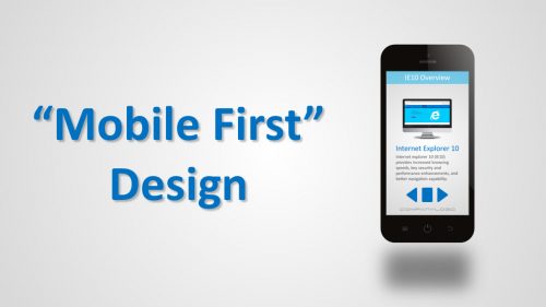
The mobile-first approach is exactly as it sounds: designing for the smallest screen and working your way up. It is one of the best strategies to create either a responsive or adaptive design.
~ Ben Gremillion | A Hands-On Guide to Mobile-First Responsive Design
If an eLearning professional wants to engage end users on a personal level, they must first connect with them on a technical level. And, doing so involves addressing any of a number of technical challenges ranging from internet access to the compatibility of hardware and software. This blog post presents the Mobile First approach that may help address some of these issues through careful instructional design.
Delivery Issues with Multiple Devices
One critical issue in eLearning surrounds whether or not the courseware you worked so hard on will display properly on the end user’s device. For example, graphics could be truncated on a mobile device or text presented in such a small font that it is difficult to read.
As noted by Lieve Weymeis, Captivate 2017 contains three workflows that enable content delivery on a range of devices using adaptive or responsive methods: Scalable Projects, Fluid Boxes and Break Points. While each has it own unique strengths and limitations, they all provide a means of reliably displaying content across a variety of end user devices and screen sizes.
In addition to the Captivate 2017, another option for dealing with compatibility issues involves designing eLearning courses to avoid them in the first. One such strategy, the “Mobile First” strategy, has been successfully used by web developers for some time and it could prove a useful for eLearning designers and developers.
What is Mobile First Design?
Luke Wroblewski is often credited with coining he term “Mobile First”, but a number of other developers have since expanded on the concept. In short, the Mobile First workflow involves first designing a website or application so that it works within the constraints of a mobile device (e.g., screen size), and then scaling up to other devices, such as a tablet or desktop.
For web designers, and possibly eLearning professionals, the Mobile First workflow has the key advantage of ensuring that content can be successfully delivered to the most problematic device, in terms of bandwidth and visible screen size. Additional benefits include:
- Increased Delivery Reach: designing for mobile phones opens delivery to an ever expanding user base. As of August 2018, there are currently 5 billion unique mobile subscribers worldwide, and that number continues to grow.
- Content Focus: Mobile First forces designers to focus on essential content, leading to a more meaningful and engaging user experience.
- Ease in Scalability: from a design stand point, it is easier to reorganize objects designed for a small screen to a larger screen than the reverse.
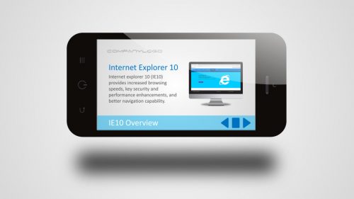
Figure 1: Mock Up of a Scalable Project Displayed on Smartphone.
Mobile First Design and eLearning
You may be surprised that you see Mobile First designs almost everyday and not just on your smartphone. If you pay attention to commercials displayed on a flat screen tv, you will notice they would also show up well on your smartphone. Such designs share a couple of key features:
- Limited Content: content is limited and very focused on key terms and product features.
- Large Text: Text is very large and, in general, uses less than 20 words.
- Simple Graphics: background graphics are not overly complex, with the content easy to identify. Graphics also lend themselves well to text overlays.
Figure 1 shows a mock up of a Mobile First screen design that would work well with Captivate’s Scalable Project workflow. The content is based on a screen from a micro lesson used during the implementation of a new web browser. As can be seen, the content doesn’t overwhelm the screen and the text, graphic and navigation controls are easily visible.
In addition, while this Scalable Project is limited to a landscape format, it will display on larger devices. Figure 2 shows a mock up of how this design will look on a laptop. While some might consider the design a bit sparse, it is still capable of communicating the critical content.
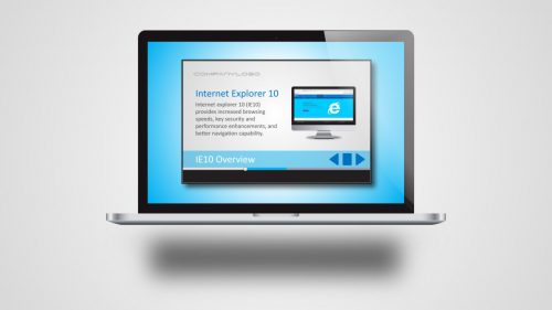
Figure 2: Mock Up of a Scalable Project Displayed on Laptop.
The Mobile First approach can also work for responsive workflows in Captivate 2017, such as Break Points and Fluid Boxes. Critical to designing for these workflows, is the careful specification of screen elements (e.g., text box, graphics), as the relative position of the elements will shift depending on the screen size.
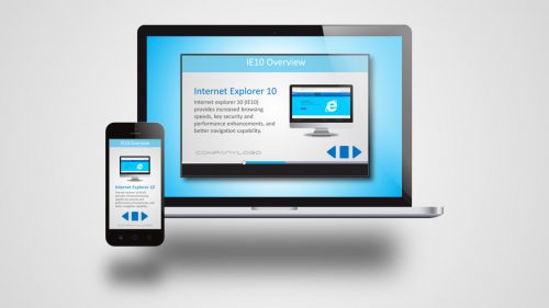
Figure 3: Mock Up of a Responsive Project on a Smartphone and Laptop.
Figure 3 shows a mock up of how a responsive Mobile First design could look on both a mobile device and a laptop. For the smartphone, the contents are essentially listed, with one screen element being below the other. This allows the width of each individual element to be as large as the screen width.
However, when the delivery device is changed to a laptop, the content shifts allowing screen elements to position themselves for better viewing in the landscape mode. Pooja Jaisingh has created a nice video “Fluid Boxes with Adobe Captivate (2017 Release)” that shows how you can create this sort of design within Captivate.
Considerations
Mobile First design is not a replacement for existing development models (e.g., ADDIE). Rather, Mobile First provides insight into key decisions and steps that can make eLearning design, development and delivery more efficient and less problematic.
When designing and developing your adaptive or responsive projects, Mobile First design suggests that you consider the following:
- Conduct a detailed needs analysis that includes the specific type of devices used by your client.
- Create detailed storyboards that include notes on content priority.
- Select the simplest workflow in Captivate that will allow you to achieve your objectives.
- Develop your project starting with the smallest screen size.
- Limit text and use a large enough font size so that it is easy to read on a small screen.
- Ensure graphics are not overly detailed and that navigation buttons are easy to see and use.
- Test you project on devices similar to what your end users will use.
Conclusion
Mobile devices are now a fact of life and their use will continue to grow in the future. For the eLearning professional, this presents the opportunity to reach more end users and reach them wherever they are located. However, Mobile devices also present challenges that need to be addressed, and a Mobile First strategy can help you design away some delivery headaches before they even appear.
References (In Order of Appearance)
Ben Gremillion | A Hands-On Guide to Mobile-First Responsive Design
Lieve Weymeis | Tough Choice: Breakpoints or Fluid Boxes?
Luke Wroblewski | Mobile First
Pooja Jaisingh | Fluid Boxes with Adobe Captivate (2017 Release)
The mobile-first approach is exactly as it sounds: designing for the smallest screen and working your way up. It is one of the best strategies to create either a responsive or adaptive design.
~ Ben Gremillion | A Hands-On Guide to Mobile-First Responsive Design
If an eLearning professional wants to engage end users on a personal level, they must first connect with them on a technical level. And, doing so involves addressing any of a number of technical challenges ranging from internet access to the compatibility of hardware and software. This blog post presents the Mobile First approach that may help address some of these issues through careful instructional design.
Delivery Issues with Multiple Devices
One critical issue in eLearning surrounds whether or not the courseware you worked so hard on will display properly on the end user’s device. For example, graphics could be truncated on a mobile device or text presented in such a small font that it is difficult to read.
As noted by Lieve Weymeis, Captivate 2017 contains three workflows that enable content delivery on a range of devices using adaptive or responsive methods: Scalable Projects, Fluid Boxes and Break Points. While each has it own unique strengths and limitations, they all provide a means of reliably displaying content across a variety of end user devices and screen sizes.
In addition to the Captivate 2017, another option for dealing with compatibility issues involves designing eLearning courses to avoid them in the first. One such strategy, the “Mobile First” strategy, has been successfully used by web developers for some time and it could prove a useful for eLearning designers and developers.
What is Mobile First Design?
Luke Wroblewski is often credited with coining he term “Mobile First”, but a number of other developers have since expanded on the concept. In short, the Mobile First workflow involves first designing a website or application so that it works within the constraints of a mobile device (e.g., screen size), and then scaling up to other devices, such as a tablet or desktop.
For web designers, and possibly eLearning professionals, the Mobile First workflow has the key advantage of ensuring that content can be successfully delivered to the most problematic device, in terms of bandwidth and visible screen size. Additional benefits include:
- Increased Delivery Reach: designing for mobile phones opens delivery to an ever expanding user base. As of August 2018, there are currently 5 billion unique mobile subscribers worldwide, and that number continues to grow.
- Content Focus: Mobile First forces designers to focus on essential content, leading to a more meaningful and engaging user experience.
- Ease in Scalability: from a design stand point, it is easier to reorganize objects designed for a small screen to a larger screen than the reverse.
Figure 1: Mock Up of a Scalable Project Displayed on Smartphone.
Mobile First Design and eLearning
You may be surprised that you see Mobile First designs almost everyday and not just on your smartphone. If you pay attention to commercials displayed on a flat screen tv, you will notice they would also show up well on your smartphone. Such designs share a couple of key features:
- Limited Content: content is limited and very focused on key terms and product features.
- Large Text: Text is very large and, in general, uses less than 20 words.
- Simple Graphics: background graphics are not overly complex, with the content easy to identify. Graphics also lend themselves well to text overlays.
Figure 1 shows a mock up of a Mobile First screen design that would work well with Captivate’s Scalable Project workflow. The content is based on a screen from a micro lesson used during the implementation of a new web browser. As can be seen, the content doesn’t overwhelm the screen and the text, graphic and navigation controls are easily visible.
In addition, while this Scalable Project is limited to a landscape format, it will display on larger devices. Figure 2 shows a mock up of how this design will look on a laptop. While some might consider the design a bit sparse, it is still capable of communicating the critical content.
Figure 2: Mock Up of a Scalable Project Displayed on Laptop.
The Mobile First approach can also work for responsive workflows in Captivate 2017, such as Break Points and Fluid Boxes. Critical to designing for these workflows, is the careful specification of screen elements (e.g., text box, graphics), as the relative position of the elements will shift depending on the screen size.
Figure 3: Mock Up of a Responsive Project on a Smartphone and Laptop.
Figure 3 shows a mock up of how a responsive Mobile First design could look on both a mobile device and a laptop. For the smartphone, the contents are essentially listed, with one screen element being below the other. This allows the width of each individual element to be as large as the screen width.
However, when the delivery device is changed to a laptop, the content shifts allowing screen elements to position themselves for better viewing in the landscape mode. Pooja Jaisingh has created a nice video “Fluid Boxes with Adobe Captivate (2017 Release)” that shows how you can create this sort of design within Captivate.
Considerations
Mobile First design is not a replacement for existing development models (e.g., ADDIE). Rather, Mobile First provides insight into key decisions and steps that can make eLearning design, development and delivery more efficient and less problematic.
When designing and developing your adaptive or responsive projects, Mobile First design suggests that you consider the following:
- Conduct a detailed needs analysis that includes the specific type of devices used by your client.
- Create detailed storyboards that include notes on content priority.
- Select the simplest workflow in Captivate that will allow you to achieve your objectives.
- Develop your project starting with the smallest screen size.
- Limit text and use a large enough font size so that it is easy to read on a small screen.
- Ensure graphics are not overly detailed and that navigation buttons are easy to see and use.
- Test you project on devices similar to what your end users will use.
Conclusion
Mobile devices are now a fact of life and their use will continue to grow in the future. For the eLearning professional, this presents the opportunity to reach more end users and reach them wherever they are located. However, Mobile devices also present challenges that need to be addressed, and a Mobile First strategy can help you design away some delivery headaches before they even appear.
References (In Order of Appearance)
Ben Gremillion | A Hands-On Guide to Mobile-First Responsive Design
Lieve Weymeis | Tough Choice: Breakpoints or Fluid Boxes?
Luke Wroblewski | Mobile First
Pooja Jaisingh | Fluid Boxes with Adobe Captivate (2017 Release)
You must be logged in to post a comment.
- Most Recent
- Most Relevant
