 Newbie
9 posts
Newbie
9 posts
A brief article on designing eLearning experiences for vision impaired users.
If you’re someone who’s creating eLearning courses (either for internal or external parties), you should keep in mind that your content is being seen and used by people with varying abilities. In this brief article I would like to put a special emphasis on how you can create better experiences for users with deuteranomaly/protanomaly (also commonly known as red-green blindness). To learn more about the different forms of colour blindness, view the site by Colour Blind Awareness.Org.
Why you should care
Depending on the type of colour blindness a person experiences, colours appear differently to him, than to someone with normal vision. According to Colour Blind Awareness.Org (see link above) people with “deuteranomaly and protanomaly are collectively known as red-green colour blind and they generally have difficulty distinguishing between reds, greens, browns and oranges. They also commonly confuse different types of blue and purple hues”. This means that especially if you are using colours to differentiate various options, or to highlight certain content, your message might not come across as clearly for these users and/or usability of your course might be impacted negatively. And these are issues you definitely don’t want to arise in your eLearning project. Last but not least you want to give users of all walks of life the opportunity to experience your eLearning course as best as possible.
Assess your colours
So how can you see how the colours you’re using (or planning to use) in your eLearning project affect users with such a vision impairment? Luckily there are several (free) tools available for simulating how content might appear for people with deuteranomaly or protanomaly. For Mac computers I’ve successfully used a tool called “Sim Daltonism”. The free tool which is available for free at https://michelf.ca/projects/sim-daltonism/ is created by Michel Fortin. In addition to the Mac software there is also a free app available for iOS devices. The software lets you move a window across your screen underneath which you see the content as it’s experienced by a vision impaired person. In the software options you can quickly switch between different impairments and assess how your colours are being experienced.
A brief online search will reveal various apps for both Windows and Mac. For instance for Windows you could use a free app called ColourSimulations.
What you can do if there’s an issue
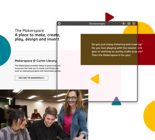
If you’ve chosen colours that might cause problems for your learners, you’ve got several options to move forward. At first you should assess how critical the colour of the object(s) is for the comprehension of your course content. As you can see in the screenshot above, the wine red box appears olive green when viewed by people with deuteranopia. While it doesn’t look pretty, it also doesn’t impact the function of the site and doesn’t negatively affect usability. In this case it might be alright to leave the colour as is. However, if your colours affect usability you could try to:
- Replace the colour with another one (sometimes not possible due to brand requirements)
- Change your course structure so you don’t rely on specific colours to bring a point across
- Add icons or pictures to help differentiate certain options
- Use a different font treatment if applicable
- Utilise additional visual elements as a differentiator
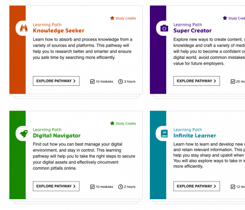
As you can see in the screenshot below, I used different icons to differentiate the four learning pathways. This was a good option in this case since the red and green colours could not be change due to branding requirements.
What is your experience with designing eLearning projects with vision impaired users in mind? Have you got additional suggestions on how to better accomodate your learners? Pop them in the comments below!
If you’re someone who’s creating eLearning courses (either for internal or external parties), you should keep in mind that your content is being seen and used by people with varying abilities. In this brief article I would like to put a special emphasis on how you can create better experiences for users with deuteranomaly/protanomaly (also commonly known as red-green blindness). To learn more about the different forms of colour blindness, view the site by Colour Blind Awareness.Org.
Why you should care
Depending on the type of colour blindness a person experiences, colours appear differently to him, than to someone with normal vision. According to Colour Blind Awareness.Org (see link above) people with “deuteranomaly and protanomaly are collectively known as red-green colour blind and they generally have difficulty distinguishing between reds, greens, browns and oranges. They also commonly confuse different types of blue and purple hues”. This means that especially if you are using colours to differentiate various options, or to highlight certain content, your message might not come across as clearly for these users and/or usability of your course might be impacted negatively. And these are issues you definitely don’t want to arise in your eLearning project. Last but not least you want to give users of all walks of life the opportunity to experience your eLearning course as best as possible.
Assess your colours
So how can you see how the colours you’re using (or planning to use) in your eLearning project affect users with such a vision impairment? Luckily there are several (free) tools available for simulating how content might appear for people with deuteranomaly or protanomaly. For Mac computers I’ve successfully used a tool called “Sim Daltonism”. The free tool which is available for free at https://michelf.ca/projects/sim-daltonism/ is created by Michel Fortin. In addition to the Mac software there is also a free app available for iOS devices. The software lets you move a window across your screen underneath which you see the content as it’s experienced by a vision impaired person. In the software options you can quickly switch between different impairments and assess how your colours are being experienced.
A brief online search will reveal various apps for both Windows and Mac. For instance for Windows you could use a free app called ColourSimulations.
What you can do if there’s an issue
If you’ve chosen colours that might cause problems for your learners, you’ve got several options to move forward. At first you should assess how critical the colour of the object(s) is for the comprehension of your course content. As you can see in the screenshot above, the wine red box appears olive green when viewed by people with deuteranopia. While it doesn’t look pretty, it also doesn’t impact the function of the site and doesn’t negatively affect usability. In this case it might be alright to leave the colour as is. However, if your colours affect usability you could try to:
- Replace the colour with another one (sometimes not possible due to brand requirements)
- Change your course structure so you don’t rely on specific colours to bring a point across
- Add icons or pictures to help differentiate certain options
- Use a different font treatment if applicable
- Utilise additional visual elements as a differentiator
As you can see in the screenshot below, I used different icons to differentiate the four learning pathways. This was a good option in this case since the red and green colours could not be change due to branding requirements.
What is your experience with designing eLearning projects with vision impaired users in mind? Have you got additional suggestions on how to better accomodate your learners? Pop them in the comments below!


You must be logged in to post a comment.
- Most Recent
- Most Relevant
I’m going to check out ColourSimulations. Thanks!
Being a member of the beta-testing team for Captivate I have mentioned this problem multiple times in the prerelease periods. Too many themes in Captivate do ignore not only those visually impaired users, but many older users due to the lack of contrast in the color use. Look at the default theme (Pearl) in CP2019. Many websites suffer from the same lack of respect for people who do not have perfect young eyes.
It is pretty disappointing that after you mentioned these issues to Adobe, no changes have been made in the final release of the software. Hopefully positive changes are going to be made sometime in the future… and yes, many websites suffer from the same problem(s). Here in Perth we’ve actually got a very knowledgable web accessibility expert: Julie Grundy (http://www.juliegrundy.id.au) – you can check one of her talks here: https://youtu.be/Wq2-cZ-vZBc
There is so much to deal with by the team, that problems like I mentioned are not high priority at all because it is considered to be only an issue to a minority of users. Most users never bother to log bus or feature request. That is the only way to get heard, not by complaining in forums where only other users are trying to help.
Captivate is a development tool, it is the designer who has to be educated in working with Accessible Design and colour selection – I preach that to my students all the time. In order to help them with colour palette development for a project, creating a theme or modifying an exiting Captivate theme, I recommend that they work with this free colour contrast analyser tool available for win and mac (link below). As you create your colour swatches you can see the colour contrast on various background colours and what level of WCAG AA or AAA the colours meet for assessible viewinghttps://developer.paciellogroup.com/resources/contrastanalyser/I use this same tool when working with Captivate, Photoshop, Illustrator and InDesign when I am creating job aids, story boards, design elements in support of any eLearning content you can use the .ase format to share the swatches between the different development tools.
