 Explorer
1 posts
Explorer
1 posts
How editing colors in Table of Contents settings appear in live course.
DISCLAIMER: This article merely helps to correlate the setting options for the Table of Contents (TOC) as it pertains to COLOR and editing the settings to reflect as intended.
When I first began using Captivate, I didn’t find the TOC settings to be intuitive or easily interpreted. Furthermore, I didn’t realize you have to refresh the TOC to apply changes (so I would preview in HTML, but not see my changes). And depending on the setting, Auto Preview may not show changes.
I’ve labeled each setting to better explain how each color is represented in the live course. Access TOC settings via Project > Table of Contents… or SHIFT + F10 (Windows) and be sure to (1) Enable/Check “Show TOC” and (2) refresh accordingly.
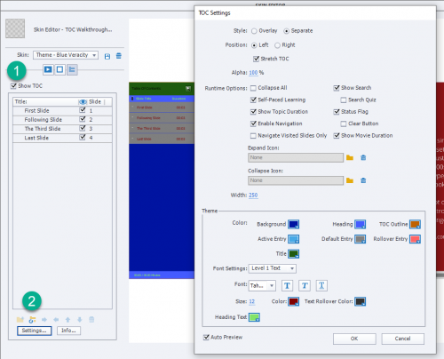
Background: royal blue/darkest blue – full BACKGROUND from top to bottom
Heading: sea blue/lighter blue – TEXT BACKING for Slide Title & Duration header
TOC: golden retriever brown – BORDER OUTLINE for TOC
Active Entry: sky blue/lightest blue – TEXT BACKING for CURRENT or active slide
Default Entry: silver – TEXT BACKING for all slides excluding current/active
Rollover Entry: salmon pink – TEXT BACKING for slide user HOVERS over
Title: forest green – TEXT BACKING for TOC title
[below Font Settings] Color: maroon – TEXT COLOR of slides excluding slide user HOVERS over
Text Rollover Color: charcoal – TEXT COLOR for slide user HOVERS over
Heading Text: lime green – TEXT COLOR for Slide Title & Duration header & if enabled, total times
*color names aren’t an exact reference
Final Tips
Though the focus of this article is color, if you want to change “Table of Contents” to the course title for example, click the bottom Info button and update the Title field.
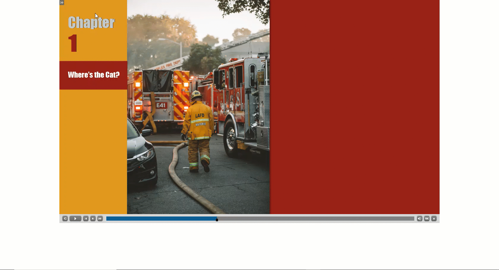
Check/enable the Overlay setting if you prefer the user open and close the TOC like this:
To learn more about TOC settings, see Adobe’s User Guide at
https://helpx.adobe.com/il_en/captivate/user-guide.html/il_en/captivate/using/table-contents-toc.ug.html
DISCLAIMER: This article merely helps to correlate the setting options for the Table of Contents (TOC) as it pertains to COLOR and editing the settings to reflect as intended.
When I first began using Captivate, I didn’t find the TOC settings to be intuitive or easily interpreted. Furthermore, I didn’t realize you have to refresh the TOC to apply changes (so I would preview in HTML, but not see my changes). And depending on the setting, Auto Preview may not show changes.
I’ve labeled each setting to better explain how each color is represented in the live course. Access TOC settings via Project > Table of Contents… or SHIFT + F10 (Windows) and be sure to (1) Enable/Check “Show TOC” and (2) refresh accordingly.
Background: royal blue/darkest blue – full BACKGROUND from top to bottom
Heading: sea blue/lighter blue – TEXT BACKING for Slide Title & Duration header
TOC: golden retriever brown – BORDER OUTLINE for TOC
Active Entry: sky blue/lightest blue – TEXT BACKING for CURRENT or active slide
Default Entry: silver – TEXT BACKING for all slides excluding current/active
Rollover Entry: salmon pink – TEXT BACKING for slide user HOVERS over
Title: forest green – TEXT BACKING for TOC title
[below Font Settings] Color: maroon – TEXT COLOR of slides excluding slide user HOVERS over
Text Rollover Color: charcoal – TEXT COLOR for slide user HOVERS over
Heading Text: lime green – TEXT COLOR for Slide Title & Duration header & if enabled, total times
*color names aren’t an exact reference
Final Tips
Though the focus of this article is color, if you want to change “Table of Contents” to the course title for example, click the bottom Info button and update the Title field.
Check/enable the Overlay setting if you prefer the user open and close the TOC like this:
To learn more about TOC settings, see Adobe’s User Guide at
https://helpx.adobe.com/il_en/captivate/user-guide.html/il_en/captivate/using/table-contents-toc.ug.html


You must be logged in to post a comment.
- Most Recent
- Most Relevant
Thank you for sharing!
Paul, you may have completely missed the goal of my comment as well. I am not astonished, but I know perfectly well what the goal was of this post. Author will not be discouraged by that comment, have discussed with her already several times. All contributions are welcome, if they are inspired as here was the case.
Will try to explain (again) my comment with ‘learning’ in mind. Let me compare with explaining how to solve a large jigsaw puzzle to someone who has never finished such a puzzle. Keep the final goal in mind, which tips would you give? Some ideas:
- Keep the final image near your work table, eventually use a loupe to screen some parts
- Try to find the corner pieces and try to join them in clusters
- Find also the border pieces and do the same
- Maybe find a part which is easily recognized (colors) and join clusters
- At the end when you have enough clusters you can try to put everything in place.
What is the big problem with most videos and blogs: they focus each on one jigsaw piece or a small cluster and never look at the complete image. Sometimes they will show blank pieces (no color, no image) to focus only on the form. That may be fine… if situated in the global view and that is the problem.
In the design part of a Captivate project, the first item to define are the Theme Colors. In my top-down view on learning which is part of my DNA, I would never use random colors in any step of a partial explanation. The reaction of InstructionalRy was not astonishing because she probably is not used to Theme Colors which have between 50 and 60 tints and high contrast is not a problem at all. Mentioning that this setup is part of a Theme may also have been a surprise. Not meant to be discouraging but nudging.
Here is another part of my DNA: when training do not do something you’ll ever label as being bad practice. Unless you want to show how you can learn from mistakes of course. For that reason any example file in my blogs always has a custom Theme. It may very limited, but Theme Colors, Theme Fonts and Master slides are always included. I will never override a style unless explaining why, and I will always label slides and objects. For each color choice the Theme Colors palette is used. Even when used for very small tips. Good practice examples, even without talking about them, get into the mind of the trainees.
One of the reasons of inefficiency of formal education is the lack of Top-Down vision: no global view. As a flute teacher I have used Maths, Physics, Biology in my flute lessons even for very small children. In Building Physics I have used my flutes as well, but my top-down view has led to different content/approach for students in Construction and for those in Real Estate. When a Building site manager has a problem, it makes no sense to search for the correct drawer (topic) of his training, she/he needs the problem solving skill developed during his formation.
Why are so many Captivate users looking for training guidelines while there is a multitude of puzzle pieces around everywhere? Suspect you know my answer at least.
I believe that not every blog post needs to be all-encompassing, and I think you are too critical of people who are merely trying to contribute something to a community. Maybe InstructionalRy is okay in this case, but I have received private messages about how frustrating it can be for people who simply wanted to share a sentence or two about their ideas on Adobe Captivate.
Setup of TOC is part of the Theme. I am very astonished that you are not even referring to another primary component of the Theme, which is the THEME COLORS PALETTE? The colors you are referring to seem to be totally random, not at all linked to those Theme colors.
Consistent design in Captivate starts with setting up a Custom Theme for the project. That starts with defining Theme fonts and Theme Colors, followed by the setup of Object Styles, Master slides and Skin (includes TOC but also the Playbar and eventually the borders). If you will have recording Software sim slides you can include the Recording Defaults.
There are 10 base colors in the Theme Colors palette and 5 (extra) tints for each base color.
http://blog.lilybiri.com/theme-colors
In 11.5 Theme fonts and Theme colors appear in the new Theme Properties. In each color dialog box the first button leads immediately to the Theme color palette, and will automatically be selected when you the feature you are editing belonged to the Theme colors.
Yes you are right! Because the focus is only the color and how it translates to the visual output, I choose strong contrasting colors to help it be more obvious what label associated VISUALLY.
This was intentional.
A Theme Color palette, well-designed, has enough contrast colors.
Themes are so badly understood and used, that I found it very sad that when talking about Color setup for one (minor) component of a Theme you didn’t even point to that palette at all. Missed chance which I find very sad.
Lieve,
You have completely missed the point of this blog post. InstructionalRy was trying to create a connection between the labels and the actual objects in the TOC to help new users understand the connection. The unusual use of colours was merely to make it obvious how elements on the TOC are associated with each label in the TOC panel.
InstructionalRy please continue to contribute to the community. I appreciate that you are trying to share your knowledge with other users. Don’t be discouraged, and please continue to be an active member of this community. We need more users sharing ideas.
Greatly appreciate your comment and words of encouragement. I will be sure to continue sharing in hopes I help others or at the least inspire 🙂
