Hi,
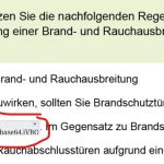
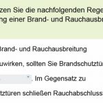
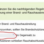
On mobile-browsers I can’t see the chosen answers (as a PNG-file) . On most mobile devices/browsers the field is always blank. On Android/Chrome I get a broken picture icon – and also the following text in the field appears:data:image/png:base64.iVBOR“. Maybe you have a solution for me?
Thanks
Hi,
On mobile-browsers I can’t see the chosen answers (as a PNG-file) . On most mobile devices/browsers the field is always blank. On Android/Chrome I get a broken picture icon – and also the following text in the field appears:data:image/png:base64.iVBOR“. Maybe you have a solution for me?
Thanks
You must be logged in to post a comment.
- Most Recent
- Most Relevant
Thanks Lieve for your reply. I’m a newbie and this is my first project . Originally the project had a default resolution of “Android (360×640)”. You can choose it, when you create an new project. There are a lot of small pictures at some foils (3-5 among themselves). But at this resolution you can’t see the details. I found the option to rescale the project and so i choose the higher resolution and the result was good. And with the option „scalable html-content“ the hole frame is shown on every device. At the early beginning I saved it as responsive, but due to lack of knowledge with the settings I let it as a static one with a fixed resolution. Later I noticed the faulty representation of the FIP-questions.
Today I took my example generic project and saved it as responsive and here now it works. I tried it with my real project and Captivate crashes every time by saving – damn.
I hope someone has a solution for my case or I have to increase my skills with responsive designs
Not many people are answering here in the portal as you may have seen.
You didn’t mention that you are a newbie. Totally understandable that a Fluid Boxes responsive project is frightening, because it is indeed not that simple. But I don’t think your approach with the rescaling (which automatically leads to quality decrease since it is upscaling) is helping.
As I mentioned at the start, I never use FIB questions. The reason is that the scoring is always black-white which is annoying when you have multiple blanks: you get the score only when all are correct. If you use Text Entry Boxes or Scrolling Text interactions in a custom question, you can avoid that.
I am sorry but am out of ideas now. Since this is a fixed resolution project you cannot count on smooth font size decrease. In most mobile browsers on phones you will never have the resolution you used for your project. Why did you choose it so big if your goal was only smartphones, it will work for tablets probably. I also use Scalable HTML a lot, but mostly because it will be needed to ‘grow’, not to ‘shrink’ as is the case for phones.
Just learned now that ‘shuffle’ is translated to ‘mixed’ which IMO is not really a correct translation.
Hi Lieve,
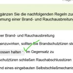
it isn’t a fluid box project. The project was created with the customized resolution of 720x1280px. The mentioned other resolution was only for an example project with default settings/master slides/object styles – and with this one I have the same problem. Thanks for your tip. I watched this in a Youtube-tutorial by Paul Wilson and it is implemented (first screenshot windows/firefox) and in the project it is the first answer (see screenshot below) but the option to mix the answers is marked. I also tried both options „marked or not“ and nothing has changed.
Thanks for the screenshots. You use the FIB question slide (which I never use, always create a custom quiz slide in that case, it is too limited to my taste). Is this a fluid boxes project since you talk about different resolutions.
A first tip: make sure that the first item on the dropdown list is the largest one, has the most characters. That will force the field to have the appropriate width to accept also that long answer (is not the case as I could see on one of the screenshots: ‘geschlossen halten’ is not the first item). BTW I understand German (bin Flamen) but don’t dare to write in Goethe’s tongue…
If it is a fluid boxes project the font size will decrease for smaller browser resolutions. However the default minimum font size is 14pt which is IMO too high. Decrease that minimum to 10 or even 8pt. You can do this in the slide Properties.
I am not sure any of these suggestions will solve the problems but worth trying.
Adobe Captivate: 2019 release (11.5.5.553)
custom resolution: 720 x 1280px
A multiple-choise question is shown correctly, because the html5-assets are used.
When I create a new project with standard options and a defined/given resolution “Android (360×640)” – and only add a fill-in-the-blank question slide without any adjustments the same thing happens.
Hello Lieve,
thanks for your first response. I made some screenshots for you. The first one is a screenshot from Windows10/Firefox. After choosing an option the chosen option is shown correctly. Also on the review-slide the visual representation is correct. It also works fine with other desktop-browsers.
Can you give some more details, please? Maybe add a screenshot of the issue?
Are you pointing to the Dropdown learning interaction or to any other dropdown list (like in the Matching type of questions)? What is that picture icon you mention?
Moreover, please add the version number as you find under Help, About Captivate.


