This blog explores the versatile custom interaction capabilities of the all-new Adobe Captivate. Through detailed examples across its interactive components, the blog demonstrates how to enhance eLearning content to cater to diverse learning styles and objectives.
The all-new Adobe Captivate offers you a variety of ways to deliver highly interactive content. Its interaction capabilities include prebuilt widgets as well as the option to create custom interactions. These provide a dual advantage: the ease and speed of using widgets for those who prefer ready-to-use templates, and the flexibility of crafting interactions for a more tailored learning experience. This blog explores creative ways to build custom interactions in Adobe Captivate that ensure an impactful learning journey.
By custom interactions, we mean creating click-to-reveal interactions using the interactive components of Adobe Captivate. These components do not, by default, reveal information upon clicking. You can use these components as clickable elements that trigger the display of hidden content upon learner interaction. This process begins by identifying content areas suitable for interactivity and planning the reveal mechanism.
Logic of Creating Custom Click-to-Reveal Interactions
Custom click-to-reveal interactions are commonly used where learners must explore supplementary details or explanations of the main content. Here’s how it typically works:
- Hidden content: The additional information is initially hidden to avoid overwhelming learners with excessive text or visual clutter.
- Component design: Any interactive component with appropriate user instruction can help learners perform certain actions to reveal hidden content. For example, a button is placed on the slide, often labeled with text like “Learn More” or “Additional Information,” indicating to learners that clicking the button will reveal more content.
- Click interaction: When learners click the component, an action is triggered to display the hidden content. This can be achieved through Captivate’s built-in show/hide functionality or by adjusting the visibility of objects using states or variables.
- Reveal animation: Designers can apply animations or transitions to the appearance of additional information, enhancing the user experience and engagement.
- Content presentation: The revealed information may include text, images, videos, or more interactive components that provide deeper insights, explanations, examples, or related resources.
- User control: Learners have control over when they access the additional information, allowing them to proceed at their own pace and delve deeper into topics of interest.
Adobe Captivate’s Interactive Components
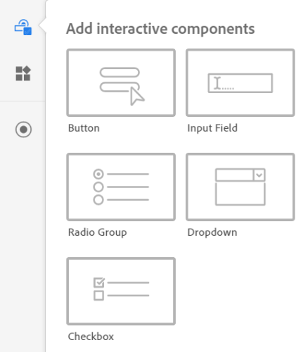
The interactive components include, ‘Button’, ‘Input Field’, ‘Radio Group’, ‘Dropdown’, and ‘Checkbox.’
Here is a short description of each of the components:
- Button: A clickable element that triggers an action or event when clicked or tapped.
- Input Field: A space where learners can enter text or numerical data.
- Radio Group: A collection of options where learners can select only one option at a time.
- Dropdown: A menu that displays a list of options, allowing learners to select one.
- Checkbox: A collection of options where learners can select more than one option at a time.
Let’s see how to build an interaction using each of these components.
Button
You can achieve various interactions to engage learners through a simple button click. These include navigation controls, such as advancing to the next slide or returning to a previous one, facilitating quiz interactions, submitting answers or resetting quizzes, and enabling branching scenarios where learners make choices that lead to different outcomes. You can create a custom click-to-reveal interaction with a button in two ways:
Method 1: Using simple hide-and-show interactions
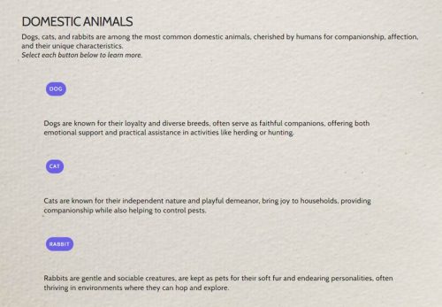
The following example demonstrates the use of hide and show interactions. On clicking the Dog, Cat, and Rabbit buttons, the relevant textual information will be displayed while concealing the rest. This interactive approach ensures focused learning by presenting content in a structured manner, allowing users to explore specific topics easily while minimizing distractions.
Here are the settings in the Interactions panel for this example:
Method 2: Combining the variables and interactions
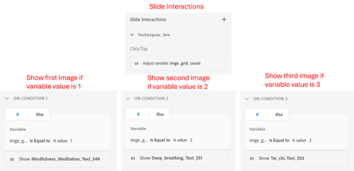
The following example demonstrates the use of variables with interactions. This can be achieved by creating a variable (image_grid_count) and incrementing its value on each click of the button “Techniques.” The following sequence initiates upon clicking the button: the first click adjusts the value of a variable to 1, displaying an image of mindfulness meditation; the , displaying an image of tai chi.
Here are the settings in the Interactions panel for this example:
Input Field
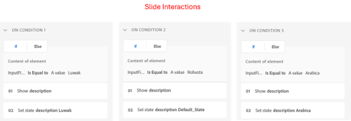
This component actively engages learners with the content. Learners can enter responses, answers, or details that drive the learning experience forward. A custom click-to-reveal interaction with the input field can be achieved by checking the value entered in the input field and displaying the corresponding information.
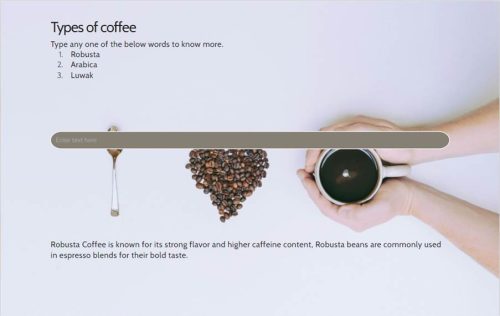
Below is an example demonstrating the implementation of custom interaction using the input field. The user inputs the name of the coffee into the field and presses enter. Upon submission, the entered information is stored in a variable and compared against predefined responses. The relevant information associated with that coffee is displayed on the screen if a match is found.
Here are the settings in the Interactions panel for this example:
Radio Group
This component facilitates various interactivities, such as quizzes, surveys, or decision-making scenarios, where learners must choose from a set of options. A radio group can be a versatile tool for creating custom click-to-reveal interactions, offering a structured approach to presenting information. By assigning each option in the radio group to a different piece of content or detail, users can click on their preferred option to reveal specific information. A custom click-to-reveal interaction with a radio group can be achieved in couple of ways:
Method 1: Using simple hide-and-show interactions
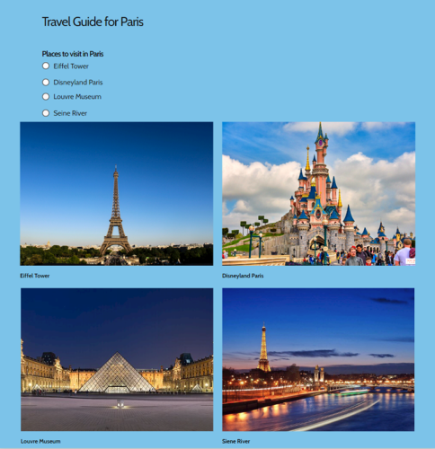
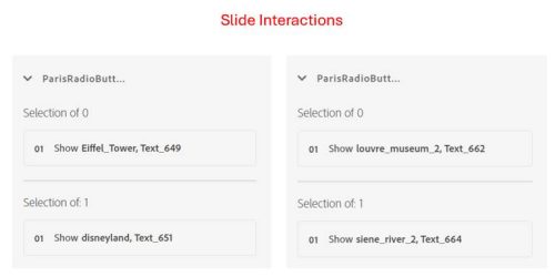
This example demonstrates the use of hide-and-show interactions. On selecting the radio button for Eiffel Tower, Disneyland Paris, Louvre Museum, and Siene River, the relevant image will be displayed.
Here are the settings in the Interactions panel for this example:
Method 2: Combining the variables and interactions
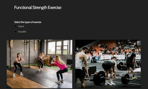
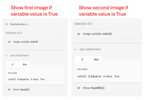
This example demonstrates the use of variables with interactions. On selecting the radio button for Squat and Deadlift, the relevant image will be displayed. The variables are employed and initialized with a value of ‘true’ upon selecting radio buttons. Subsequently, the image will be displayed solely if the condition of the variable evaluates to ‘true’.
Here are the settings in the Interactions panel for this example:
Dropdown
The dropdown menu facilitates content organization, allowing learners to seamlessly traverse through different sections. It is a compact and clean method to offer learners multiple choices without immediately overwhelming them with visible options. This component is ideal for quizzes or exploratory learning where space conservation is critical. A custom click-to-reveal interaction with a radio group can be achieved in couple of ways:
Method 1: Using simple hide-and-show interactions
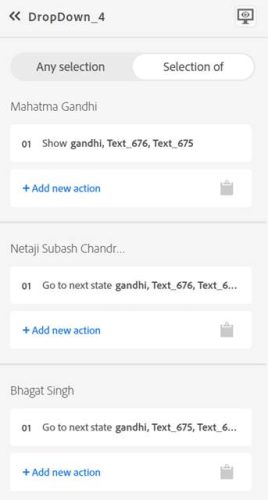
This example demonstrates the use of hide-and-show interactions. The dropdown is used for presenting information about the freedom fighters of India. When a learner selects a name, a brief biography or significant facts about that figure are revealed below the dropdown. The corresponding text and images of the freedom fighter are added using the states of the image component.
Here are the settings in the Interactions panel for this example:
Method 2: Combining the variables and interactions
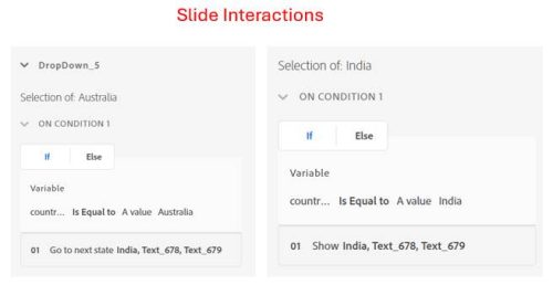
This example demonstrates the use of variables with inetractions. The dropdown is used to present a list of Countries. A brief overview of the country flag is revealed below the dropdown when a learner selects any country. Integration of the corresponding text and flags is facilitated by utilizing states within the image component. A variable is assigned the value of the selected country name, and information will only be displayed if the variable value corresponds to a particular country.
Here are the settings in the Interactions panel for this example:
Checkbox
These facilitate content exploration and navigation. Learners can select checkboxes corresponding to topics or sections they wish to explore, allowing for a personalized learning journey tailored to their interests and needs. A custom click-to-reveal interaction with the checkbox can be achieved by checking the values and displaying the corresponding information.
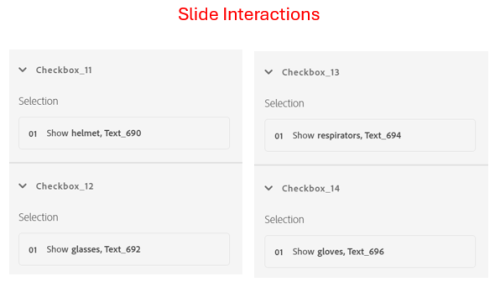
In the example below, learners must select all necessary safety equipment before entering in a manufacturing plant. Each checkbox corresponds to a helmet, glasses, respirator, and gloves. As items are checked, details on why each is essential could be displayed with appropriate images.
Here are the settings in the Interactions panel for this example:
Conclusion
The examples discussed in this blog demonstrate just a fraction of the limitless creative possibilities Adobe Captivate offers for crafting custom interactions. Whether you’re utilizing hide-and-show techniques or complex variable-driven interactions, Adobe Captivate empowers you to tailor engaging and dynamic eLearning experiences to meet diverse educational needs. Start exploring these functionalities and unlock your potential to create unique and impactful learning journeys.
Please log in and complete your profile to continue.
You must be logged in to post a comment.
- Most Recent
- Most Relevant


