 Notification
 Newbie
4 posts
Newbie
4 posts
What!!! You haven’t created a responsive eLearning course yet using Adobe Captivate 8 or 9?
 Well, I hate to inform you, but you are already behind the times. So let me help you get with it and get with it fast!!!
A little bit of history on my experience with responsive design. I am NOT a coder. I am not prolific with HTLM or CSS. That is why I love Adobe Captivate’s ability to provide responsive design. I helped Kevin Siegel write his chapter on Responsive Design when Adobe Captivate 8 was released and since then, I not only, teach Responsive Design for Iconlogic, but have presented at several conferences on responsive design. And I don’t just talk the talk, I have developed responsive design e/mLearning courses for a variety of customers since Adobe Captivate 8 was released.
Before I go in to how to create your first responsive eLearning course, let me explain why you should embark on the journey from eLearning to mLearning.

First, let’s take a look at some statistics: the sale of mobile devices (cell phones in particular) has far exceeded the sales of desktops…
- There are over a billion smart phones around the world.
- Mobile learning is already a 5.3 billion-dollar industry.
- Out of the 91% of adults who own cell phones, 63% of them use their phone on-line.
- Studies show that mobile learning increases motivation and attendance, which therefore, means increase in retention and productivity.
- The majority of organizations recognize the importance of mobile devices and have already implemented a mobile learning strategy.
Not convinced yet?
It is predicted that by 2018, 70% of professionals will do some work from their own personal phones after hours and while traveling.
Okay, now let’s take a look at some of the statistics on the results of learners from being able to use mobile learning as training 
- 37% greater employee productivity when learners are able to use their mobile devices
- 34% better response from customers
- 26% greater ability to deliver quality goods
- and 72% of organizations who are using eLearning believe it is providing them with the competitive advantage by providing real-time on-demand training.
The big gest benefit to online learning on multi-devices is that it ensures you are in sync with today’s young and modern learner. Delivering effective, self-paced content that learners can access anywhere, motivates them and produces better results in retention and production.
The reality is that all eLearning designers/developers need to take mLearning design into consideration from the outset.

Because the reality is that learners can be learning on any size device.
So what is responsive design?
Just in case you don’t know… responsive design for Adobe Captivate is a way to develop online courses that detect the learner’s screen size and orientation and automatically change the size and position of the objects to adjust to the device size without the developer using code. Now this doesn’t meant that there isn’t work to do…
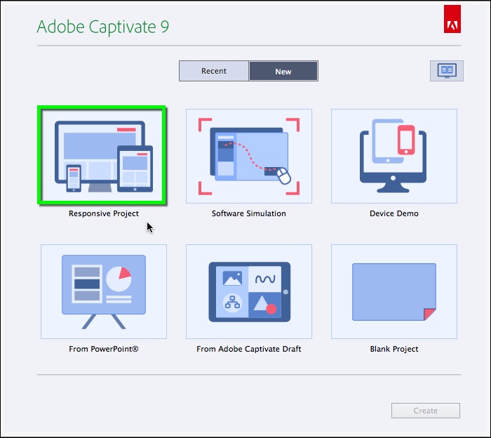
In a nut shell – below are steps to creating your first Responsive Project in Adobe Captivate
Note: These steps should be taken AFTER you have already written your storyboard, created a design for each size device, and have a company branding that you will use.
- Open a Responsive Design project (see image on right)

- Determine your breakpoints
- Determine the Height of each break point
- Create your Theme/Template
- Insert your content onto the Desktop break point
- Adjust the size and position of the objects on the other break points as needed
- Preview and test on various devices and browsers
- Publish and test
Ready to go in to a deeper dive?
 2. Determine your breakpoints
After you open a responsive project, the first thing you’ll need to decide what size your breakpoints are going to be and how many you want to include. The minimum is 3 and the maximum 5.
Click on the + signs to add more break points.
A default breakpoints are not a bad place to start but if you have specific device sizes you are trying to accommodate, I recommend going to http://viewportsizes.com
You can also adjust your breakpoint sizes by using the arrows on either end. SHAPE * MERGEFORMAT
3. Determine the Height of each breakpoint: In the Properties panel of every break point, you can adjust the device height

Note 1: if you are using Captivate’s default playbar for the desktop and Tablet breakpoints, you will want to leave them at 627. If you are creating your own custom playbar you could change the height to 768. However, the mobile (phone height) will depend on which phone size you are targeting.
Note 2: Height is not responsive: For instance if you create a height of 568 that will fit an iPhone 5 (Portrait view). There will be white space at the bottom of an iPhone 6 (Portrait view) because its height is 667
Note 3: If you change the Slide Height of that particular slide (this is not global throughout the project, it is unique for that one slide). So if the Slide Height is 667 and the Device Height is 568, the learner will have to scroll to view the content below 568.
4. Create your Theme/Template
a. Select one of the Themes that come with Captivate b. Select Theme Colors button

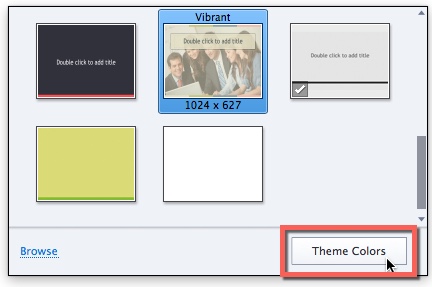
c. Select Customize Button d. Type in a name and change your color boxes


5. Insert your content onto the Desktop breakpoint
As with all  projects, you need to insert your content into either Captivate’s library and then onto the slides or directly onto the slides.
Ensure you are on the Desktop breakpoint when you insert content onto your slide.
When you have an object selected on the slide, your Position Properties tab will appear. If it does not go to Window > Position Properties.
6. Adjust the size and position of the objects on the other break points as needed 
This is the nuts and bolts of creating responsive projects. Apply layout views unique properties by controlling the size and position of the objects on the slide. As you will see by the above image, the objects size and position is based on percent relative to the size of the device.
You need to understand some definitions.
Object position – Where it is positioned on the slide, the default is Top/Left
Object size – the width and height of an object, the default is Height: Auto and Width: %
Smart Position – Use this option to view the lines of positioning of the object in the project.
% – Choose percent for object dimension or position to be a percentage of the Stage width or height.
Pixel – If you want object dimension or position to be a fixed width or height.
Auto – Maintains aspect ratio.
% Relative – This option maintains the overlay position. Appears only to height-related properties.
You can also use % Relative to link objects.
Some other tips:
 Text: You can create responsive text for all break points by using Edit > Object Style Manager. Here you can select the type of object, and change the properties for each break point.
Aligning: You can also align objects to stick to the center either horizontally and/or vertically by expanding the Advanced section in the Position Properties.
Software simulations. When you add software simulations into a responsive project, Captivate automatically makes it responsive, you don’t have to do anything other than create the simulation and edit the captions as before. To insert a software simulation, you must have a responsive project open and then go to the Slide + icon and select Software Simulation.
Drag and Drop interactions are responsive. To insert a drag and drop go to Interaction and select Drag and Drop. Create the drag and drop interaction as you would a non-responsive project.
7. Preview and test on various devices and browsers 
When you preview a responsive project it always opens in our default HLTM5 browser. You can use the slider to view how the objects will adjust on any size device. When you drag the slider, you will see the a number in the middle of the screen that shows you the horizontal size of the device.
8. Publish and test

Always publish and test your courses on the specific device or use a browser like Chrome that allows you to have developer tools to see how the course will look on specific size devices. Go to Chrome Settings > More Tools > Developer Tools and adjust the size device and the orientation from there.

Sources: Brandon Hall Group; Forbes; eLearningIndustry.com; HR Chally; Sales Readiness Group; Research institute of America; LearnFrame; The information Daily; Bersin and Associates; Capterra; IBM; Aurion Learning; Horizon Report; Molly Fletcher; CertifMe.Net; The Rapid E-Learning Blog; World Journal of Education
What!!! You haven’t created a responsive eLearning course yet using Adobe Captivate 8 or 9?
Well, I hate to inform you, but you are already behind the times. So let me help you get with it and get with it fast!!!
A little bit of history on my experience with responsive design. I am NOT a coder. I am not prolific with HTLM or CSS. That is why I love Adobe Captivate’s ability to provide responsive design. I helped Kevin Siegel write his chapter on Responsive Design when Adobe Captivate 8 was released and since then, I not only, teach Responsive Design for Iconlogic, but have presented at several conferences on responsive design. And I don’t just talk the talk, I have developed responsive design e/mLearning courses for a variety of customers since Adobe Captivate 8 was released.
Before I go in to how to create your first responsive eLearning course, let me explain why you should embark on the journey from eLearning to mLearning.
First, let’s take a look at some statistics: the sale of mobile devices (cell phones in particular) has far exceeded the sales of desktops…
- There are over a billion smart phones around the world.
- Mobile learning is already a 5.3 billion-dollar industry.
- Out of the 91% of adults who own cell phones, 63% of them use their phone on-line.
- Studies show that mobile learning increases motivation and attendance, which therefore, means increase in retention and productivity.
- The majority of organizations recognize the importance of mobile devices and have already implemented a mobile learning strategy.
Not convinced yet?
It is predicted that by 2018, 70% of professionals will do some work from their own personal phones after hours and while traveling.
Okay, now let’s take a look at some of the statistics on the results of learners from being able to use mobile learning as training
- 37% greater employee productivity when learners are able to use their mobile devices
- 34% better response from customers
- 26% greater ability to deliver quality goods
- and 72% of organizations who are using eLearning believe it is providing them with the competitive advantage by providing real-time on-demand training.
The biggest benefit to online learning on multi-devices is that it ensures you are in sync with today’s young and modern learner. Delivering effective, self-paced content that learners can access anywhere, motivates them and produces better results in retention and production.
The reality is that all eLearning designers/developers need to take mLearning design into consideration from the outset.
Because the reality is that learners can be learning on any size device.
So what is responsive design?
Just in case you don’t know… responsive design for Adobe Captivate is a way to develop online courses that detect the learner’s screen size and orientation and automatically change the size and position of the objects to adjust to the device size without the developer using code. Now this doesn’t meant that there isn’t work to do…
In a nut shell – below are steps to creating your first Responsive Project in Adobe Captivate
Note: These steps should be taken AFTER you have already written your storyboard, created a design for each size device, and have a company branding that you will use.
- Open a Responsive Design project (see image on right)
- Determine your breakpoints
- Determine the Height of each break point
- Create your Theme/Template
- Insert your content onto the Desktop break point
- Adjust the size and position of the objects on the other break points as needed
- Preview and test on various devices and browsers
- Publish and test
Ready to go in to a deeper dive?
2. Determine your breakpoints
After you open a responsive project, the first thing you’ll need to decide what size your breakpoints are going to be and how many you want to include. The minimum is 3 and the maximum 5.
Click on the + signs to add more break points.
A default breakpoints are not a bad place to start but if you have specific device sizes you are trying to accommodate, I recommend going to http://viewportsizes.com
You can also adjust your breakpoint sizes by using the arrows on either end. SHAPE * MERGEFORMAT
3. Determine the Height of each breakpoint: In the Properties panel of every break point, you can adjust the device height
Note 1: if you are using Captivate’s default playbar for the desktop and Tablet breakpoints, you will want to leave them at 627. If you are creating your own custom playbar you could change the height to 768. However, the mobile (phone height) will depend on which phone size you are targeting.
Note 2: Height is not responsive: For instance if you create a height of 568 that will fit an iPhone 5 (Portrait view). There will be white space at the bottom of an iPhone 6 (Portrait view) because its height is 667
Note 3: If you change the Slide Height of that particular slide (this is not global throughout the project, it is unique for that one slide). So if the Slide Height is 667 and the Device Height is 568, the learner will have to scroll to view the content below 568.
4. Create your Theme/Template
a. Select one of the Themes that come with Captivate b. Select Theme Colors button
c. Select Customize Button d. Type in a name and change your color boxes
5. Insert your content onto the Desktop breakpoint
As with all projects, you need to insert your content into either Captivate’s library and then onto the slides or directly onto the slides.
Ensure you are on the Desktop breakpoint when you insert content onto your slide.
When you have an object selected on the slide, your Position Properties tab will appear. If it does not go to Window > Position Properties.
6. Adjust the size and position of the objects on the other break points as needed
This is the nuts and bolts of creating responsive projects. Apply layout views unique properties by controlling the size and position of the objects on the slide. As you will see by the above image, the objects size and position is based on percent relative to the size of the device.
You need to understand some definitions.
Object position – Where it is positioned on the slide, the default is Top/Left
Object size – the width and height of an object, the default is Height: Auto and Width: %
Smart Position – Use this option to view the lines of positioning of the object in the project.
% – Choose percent for object dimension or position to be a percentage of the Stage width or height.
Pixel – If you want object dimension or position to be a fixed width or height.
Auto – Maintains aspect ratio.
% Relative – This option maintains the overlay position. Appears only to height-related properties.
You can also use % Relative to link objects.
Some other tips:
Text: You can create responsive text for all break points by using Edit > Object Style Manager. Here you can select the type of object, and change the properties for each break point.
Aligning: You can also align objects to stick to the center either horizontally and/or vertically by expanding the Advanced section in the Position Properties.
Software simulations. When you add software simulations into a responsive project, Captivate automatically makes it responsive, you don’t have to do anything other than create the simulation and edit the captions as before. To insert a software simulation, you must have a responsive project open and then go to the Slide + icon and select Software Simulation.
Drag and Drop interactions are responsive. To insert a drag and drop go to Interaction and select Drag and Drop. Create the drag and drop interaction as you would a non-responsive project.
7. Preview and test on various devices and browsers
When you preview a responsive project it always opens in our default HLTM5 browser. You can use the slider to view how the objects will adjust on any size device. When you drag the slider, you will see the a number in the middle of the screen that shows you the horizontal size of the device.
8. Publish and test
Always publish and test your courses on the specific device or use a browser like Chrome that allows you to have developer tools to see how the course will look on specific size devices. Go to Chrome Settings > More Tools > Developer Tools and adjust the size device and the orientation from there.
Sources: Brandon Hall Group; Forbes; eLearningIndustry.com; HR Chally; Sales Readiness Group; Research institute of America; LearnFrame; The information Daily; Bersin and Associates; Capterra; IBM; Aurion Learning; Horizon Report; Molly Fletcher; CertifMe.Net; The Rapid E-Learning Blog; World Journal of Education
You must be logged in to post a comment.
- Most Recent
- Most Relevant
It is because what Adobe calls as ,,responsive design” inside Captivae, is not really responsive design – this is adaptive/fluid layouts systems, wich depends of 3 or 5 key points and break from one to another layout of ,,3 or 5 versions of layout”. That is, why you have some white space around layout of your course. Tru responsive design have only one layout, fully responsive to with and height of device.
You’re absolutely right Jaroslav. Hopefully, Adobe can improve on the software’s “responsive” capabilities in future updates.
True responsive design adapts for any device and/or device orientation. From what I’ve seen and read, Adobe wants developers to target specific devices. Every setting I’ve tried on mobile devices resulted in 50 to 200 pixels of white space at the bottom of the screen (portrait orientation) or scrolling (landscape orientation). Hopefully, Adobe can implement a framework similar to Bootstrap in later releases.
You are correct, the height is specific to the breakpoint but the horizontal is truly responsive.
I am having the same issue. I am getting white space at the bottom. that’s a big fault captivate 9. captivate must improve the responsive feature in future updates.
Great post Anita!
A feature I find useful is that Captivate color codes those object position/size properties to match whichever view is currently controlling them.
Nice tip about using Chrome Dev Tools (F12) to test those sizes. I would also add that Review My eLearning is a great way for non-developers to test the breakpoints: https://www.youtube.com/watch?v=finTEKspdvY
Thanks. Good point James!
Great article Anita – will there be a follow up article on Publishing As Apps ?
Thanks JT!
