 Notification
 Explorer
32 posts
Explorer
32 posts
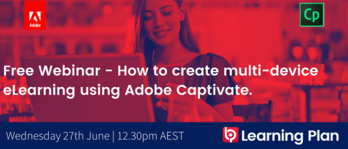
DATE: Wed 27th June
TIME: 12:30pm – 1:15pm AEST
REGISTER HERE: https://adobe.ly/2J4m0Jl
We’ve all experienced responsive web design, usually in the form of web pages that make use of flexible layouts, images and cascading style sheets (CSS) that detect your mobile phone’s screen size and orientation and change the layout accordingly.
As more organisations embrace learning across multiple devices (desktops, laptops, tablets and phones) we now need to develop content that is responsively designed to work across these environments.
Where do you start? What are the best practices? Where’s my hoverboard?!
Come along to our June webinar, where our in-house design genius and Adobe Captivate Expert, John Stericker, can teach you all about it. If you’re flummoxed by Adobe Captivate fluid boxes, scalable HTML or creating multiple designs for multiple devices, we’ve got you covered!
Adobe Captivate 2017 includes the option to publish a project as scalable HTML5 and at times, this can be a more appropriate approach over creating a responsive design using breakpoints or fluid boxes. We’ll show you how to create multi-device eLearning without the need to build multiple designs, by using this scalable HTML5 publishing feature. We’ll also run through why you would build a responsive project, when you should consider a responsive design and when you might want to avoid it.
Join us on the 27th!
You must be logged in to post a comment.
- Most Recent
- Most Relevant
look forward for the session.
Yes, we record all our webinars. They can be viewed on our Youtube channel here > https://www.youtube.com/channel/UCFF0GrAwbWuj0mSUI10ZmBg
I would love to attend this webinar but unfortunately it is scheduled at 4:30 am accordign to my Time Zone. Are you going ot record it so I can watch it afterwards? Thanks!
Hi sorry for the late reply, we did upload here to YouTube. Enjoy 🙂
