 Notification
 Newbie
5 posts
Newbie
5 posts
Should I use Scalable HTML or a Responsive project when building eTraining for applications? What is the difference between Scalable and Responsive?
Adobe Captivate eLearning Support for Mobile Devices
Adobe Captivate offers two methods for generating application training and software simulations for mobile devices: Scalable HTML and Responsive projects. The decision to develop for both desktop and mobile is increasingly important as more applications are available on a variety of mobile devices (tablets, phones) as well as desktops. The default has been to only develop for desktops.
Before undertaking a Captivate Project
The decision whether to develop Scalable or Responsive project must be informed by the specifics of the target application, for which training is designed. So, before undertaking a Captivate project, a trial should be done on both desktop and mobile platforms to see if the target application behaves differently on different platforms. Some commercial applications “detect” the platform that is being used and automatically adjust.
If possible, test on both Apple (e.g. iPhone) and Android devices. If the target application behaves differently for different devices, the project may warrant multiple recordings – one for each mode. Assuming that the target application is very similar on different platforms, a single project may be sufficient. Having confirmed the behavior of the target application on different devices and whether a single or multiple projects will be necessary the next decision is Scalable or Responsive.
Scalable HTML or Responsive project?
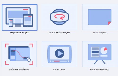
An eLearning designer should consider from the outset, whether the new systems training project needs to be “Responsive” or “Scalable”. One of these paradigms is selected before a project is started.
- The responsive project would be initiated from the Responsive Project icon.

- Scalable HTML is set at publishing. Note “checkbox” for Scalable HTML content.

Note: A scalable project can be started as a Blank project or Software Simulation. For eTraining for applications, I use Software Simulation.
Both are Viewable on Mobile Devices. What’s the difference?
It is helpful to know the difference between Scalable and Responsive projects in order to make a decision. Both types of projects can be viewed on a mobile device.
- Scalable Projects —
When selected. The “scalable” attribute is selected when publishing. Note that this relates to HTML5 publishing format. The SWF format is not available for mobile devices and hence “scalable” for mobile would not be applicable.Screen image. For scalable projects, the screen image captured remains the same regardless of the device that the project is viewed on. The image “scales” to the size of the device.Preview. Projects must be published to be viewed on different sizes. Once published, the project can be viewed in a browser and the browser resized* for each deployment platform (device).
*Useful references: Reference for common screen sizes – http://screensiz.es/ (Utilize the H and W columns) and http://howbigismybrowser.com/ as you resize your browser in order to view the published scalable project.
- Responsive Projects —
When selected. The responsive format is set when the project is initiated by selecting the Responsive Project icon.Screen image. Responsive projects allow for greater control on what part of a screen image is displayed depending upon the type of device used for viewing the training. For each screen size, a different area of the screen can be selected.Preview. The different viewing sizes are available during project development. The viewing modes can be selected from tabs in the development window. Additionally, the output can be published and viewed on different platforms.


Conclusion
In conclusion, Scalable projects allow for software simulations to run on multiple platforms, but, as a designer, there is little control on how the eTraining is presented. Responsive projects require more effort to design for multiple devices but provide for great control on presentation.
Adobe Captivate eLearning Support for Mobile Devices
Adobe Captivate offers two methods for generating application training and software simulations for mobile devices: Scalable HTML and Responsive projects. The decision to develop for both desktop and mobile is increasingly important as more applications are available on a variety of mobile devices (tablets, phones) as well as desktops. The default has been to only develop for desktops.
Before undertaking a Captivate Project
The decision whether to develop Scalable or Responsive project must be informed by the specifics of the target application, for which training is designed. So, before undertaking a Captivate project, a trial should be done on both desktop and mobile platforms to see if the target application behaves differently on different platforms. Some commercial applications “detect” the platform that is being used and automatically adjust.
If possible, test on both Apple (e.g. iPhone) and Android devices. If the target application behaves differently for different devices, the project may warrant multiple recordings – one for each mode. Assuming that the target application is very similar on different platforms, a single project may be sufficient. Having confirmed the behavior of the target application on different devices and whether a single or multiple projects will be necessary the next decision is Scalable or Responsive.
Scalable HTML or Responsive project?
An eLearning designer should consider from the outset, whether the new systems training project needs to be “Responsive” or “Scalable”. One of these paradigms is selected before a project is started.
- The responsive project would be initiated from the Responsive Project icon.
- Scalable HTML is set at publishing. Note “checkbox” for Scalable HTML content.
Note: A scalable project can be started as a Blank project or Software Simulation. For eTraining for applications, I use Software Simulation.
Both are Viewable on Mobile Devices. What’s the difference?
It is helpful to know the difference between Scalable and Responsive projects in order to make a decision. Both types of projects can be viewed on a mobile device.
- Scalable Projects —
When selected. The “scalable” attribute is selected when publishing. Note that this relates to HTML5 publishing format. The SWF format is not available for mobile devices and hence “scalable” for mobile would not be applicable.Screen image. For scalable projects, the screen image captured remains the same regardless of the device that the project is viewed on. The image “scales” to the size of the device.Preview. Projects must be published to be viewed on different sizes. Once published, the project can be viewed in a browser and the browser resized* for each deployment platform (device).
*Useful references: Reference for common screen sizes – http://screensiz.es/ (Utilize the H and W columns) and http://howbigismybrowser.com/ as you resize your browser in order to view the published scalable project.
- Responsive Projects —
When selected. The responsive format is set when the project is initiated by selecting the Responsive Project icon.Screen image. Responsive projects allow for greater control on what part of a screen image is displayed depending upon the type of device used for viewing the training. For each screen size, a different area of the screen can be selected.Preview. The different viewing sizes are available during project development. The viewing modes can be selected from tabs in the development window. Additionally, the output can be published and viewed on different platforms.
Conclusion
In conclusion, Scalable projects allow for software simulations to run on multiple platforms, but, as a designer, there is little control on how the eTraining is presented. Responsive projects require more effort to design for multiple devices but provide for great control on presentation.
You must be logged in to post a comment.
- Most Recent
- Most Relevant
Great article with a wonderful breakdown of both scalable and responsive projects.
Glad to have this topic explained well and for the link to Lieve’s blog. Trying to sort out what platform the user is using can be dizzying. But there seems to be work-arounds for all
Sorry to add some comment. There are TWO workflows for responsive projects:
- Fluid Boxes, which is the one you are talking about
- Breakpoint views which allow total control, and even replacing complicated items by simple ones for small screens.
Will post a link to comparison of the THREE workflows, which explain the advantages/disadvantages of all, and have links to example files as well.
