 Notification
 Legend
245 posts
Legend
245 posts
Overview of the older type of buttons, how they are used, their common features and my personal recommendations for using them. Next blog will explain the newer types of buttons: Shape button, Bitmap image used as button, SVG used as button.
- Intro
Captivate ‘s most recent release, 11.5.0.476 added two types to the button treasure chest. You all know that the button is perhaps the most used interactive object. If you are only creating non-responsive projects, you may sometimes replace it by a click box, but that is not a possibility for Fluid Boxes projects. In this post you’ll find an overview of all button types, with their advantages and disadvantages.
Common features
Here is a short list of what you’ll find in any button, whatever its type:
- The ability to pause the playhead or not by adding a pausing point, which you can do in the Timing Properties panel. The pausing point will appear with the typical pause symbol on the button timeline. Pausing point will not stop everything (see Pausing Timeline).
- Two events ‘Success’ and ‘Last Attempt’ (not with Infinite attempts) which you can use to trigger any possible action. Success event means clicking the button, Failure means clicking outside of the button.
- Add-on of two extra InBuilts state on top of the Normal state Rollover and Down states. A fourth InBuilt state exists but is not automatically created; Visited. Inbuilt states typically appear in a situation. The form of the button in those states has size and location locked to the Normal state. however you can add more items in each state and define Custom states as well.
The 6 types can be divided in two groups of 3:
- Old types (which I have known since I started using Captivate) – topic of this blog post
- Newer types will be in part 2
Old Button Types
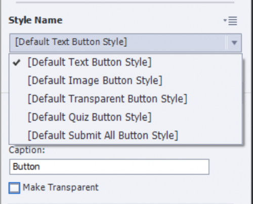
Those are Text buttons, Transparent buttons and Image buttons. They can be added using the Interactions button, option Button. You will always get a Text button. If you want a Transparent or an Image button, you have to open the dropdown list under Style Name in the Properties panel. Image button is the second choice, Transparent the third. In this screenshot (same for most included themes) two more styles are visible, both for quiz buttons (which are also transparent buttons).
Some features are common for those three older types:
- Their timeline is green.
- They have a default object style, which you can define in the Object Style Manager. The object style includes the InBuilt states Normal, Rollover and Down (not Visited). Like all object styles they will be included in the (custom) theme. Multiple object styles are possible for each type. To reuse such a button use either the theme, or you can export/import individual styles in a new project.
- Bounding box of the button is the clickable area, whatever the shape of the button (for image buttons).
- They cannot be used on master slides.
- They cannot be timed for the rest of the project.
- They can be used for the embedded buttons on quiz and score slides.
- They cannot be used as extra (custom) button on a quiz or a score slide.
- You cannot use copy/paste appearance, not even between buttons of the same type.
- They will not show up in the Library.
Text Button
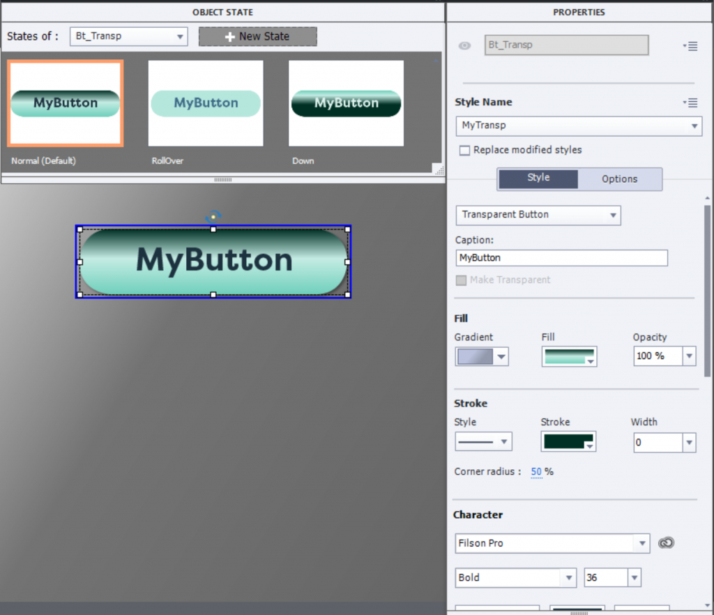
This type is always rectangular. Fill nor stroke can be edited. You can only make the button transparent, which results in only the Label showing up (see screenshot with dropdown list for the checkbox ‘Make Transparent’. Look at this screenshot for a possible ‘look’ of the states:

The text on the button needs to be typed under ‘Caption’ in the Properties panel, not in the button itself. The text can be formatted: font, font size, font color and attribute.
Tips for use
Since Captivate 6 I have never used this type anymore. Not being able to use theme colors for its style is a show stopper for me. Using the option ‘Make transparent’ is not very appealing since it still keeps the bounding box as clickable area. Personally I regret that this button type is the default type when using the Button option under Interactions.
Transparent Button
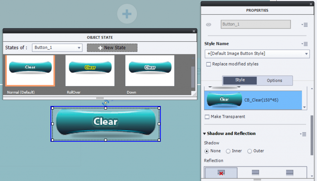
This type can be a rectangle or a rounded rectangle. Fill can be edited, offers the same options as shapes: Solid color, gradient, texture or image fill. The button text needs also to be typed in the Properties panel (same as for Text button). Font styling has same features as with text button. There is no ‘Make Transparent’ option, but you can edit the Opacity for the fill and the width of the stroke. Setting both to 0 will result in transparency. The name of the button type is bit confusing, don’t you think. Usually that button is not transparent, but the most flexible of the old types. Have a look at this example:
Tips for use
Since quiz and score slides need an old type for the embedded buttons, this one is my preferred type. That is due to its better styling options, which makes it possible to give the transparent button exactly the same look as a shape button (which is still more flexible). You may wonder: why not an Image button? Read below why.
Image button
Before shapes appeared with version 6 I have created a lot of image buttons. You need a graphics application to do so:
- Create three graphics (bitmap), you are free to choose the type. I mostly use PNG (allows alpha channel), but you can use BMP (was the original choice), GIF… Graphics need to be exactly the same size.
- The images need to have the same name, but followed by _up, _over, _down. You can see a lot of image buttons in the GalleryButtons under the installation folder:

- Save the buttons in the same folder, doesn’t have to be the GalleryButtons folder. You would need administrator rights to add them in that folder.
- After inserting an image button, use either the dropdown list (for included image buttons) or the Browse icon (for custom image buttons stored elsewhere) and point to one of the graphics. Which one is not important, Captivate will recognize the other graphics and use them for the appropriate state.

You see that the name on the button needs to be part of the image which is one of the disadvantages of this type of buttons. You need a lot of duplicates, each with its proper label as you could see in the excerpt from GalleryButtons shown above. You see also that the size of the button is mentioned next to its description, for the included buttons. Since those are bitmap image, it is best to use them at their original size. Increasing the size leads to loss of crispness as is very well visible in the last screenshot. - Whatever the shape of the image, the clickable area remains the surrounding bounding box.

Tips for use
Since shapes became available, which can be filled with an image (see Turn an image into a button) I never used image buttons. Now, with 11.5 you can use both bitmap images and SVG’s directly as buttons. In my series about Tweaking Quiz slides, I mentioned them as only solution for a Fluid Boxes project to Tweak a Results slide. As you can read in that post, I used it exactly because it was possible to make an image button totally transparent, which is not possible for a Text Button nor a Transparent button because of the label. That is the only exceptional situation where I recommend an Image button?-.µ
The second trio of button types will be described in the next blog.
Assets Panel
None of the button types described in this post can be found in the new Assets panel.
Text buttons and Transparent buttons are based on object styles, which are part of the Theme.
Image buttons also have an object style, and the image buttons packaged with Captivate have their graphics in GalleryButtons under the installation folder. They are not in the eLearning assets. You can create graphics for custom Image buttons, and store them wherever you want.
- Intro
Captivate ‘s most recent release, 11.5.0.476 added two types to the button treasure chest. You all know that the button is perhaps the most used interactive object. If you are only creating non-responsive projects, you may sometimes replace it by a click box, but that is not a possibility for Fluid Boxes projects. In this post you’ll find an overview of all button types, with their advantages and disadvantages.
Common features
Here is a short list of what you’ll find in any button, whatever its type:
- The ability to pause the playhead or not by adding a pausing point, which you can do in the Timing Properties panel. The pausing point will appear with the typical pause symbol on the button timeline. Pausing point will not stop everything (see Pausing Timeline).
- Two events ‘Success’ and ‘Last Attempt’ (not with Infinite attempts) which you can use to trigger any possible action. Success event means clicking the button, Failure means clicking outside of the button.
- Add-on of two extra InBuilts state on top of the Normal state Rollover and Down states. A fourth InBuilt state exists but is not automatically created; Visited. Inbuilt states typically appear in a situation. The form of the button in those states has size and location locked to the Normal state. however you can add more items in each state and define Custom states as well.
The 6 types can be divided in two groups of 3:
- Old types (which I have known since I started using Captivate) – topic of this blog post
- Newer types will be in part 2
Old Button Types
Those are Text buttons, Transparent buttons and Image buttons. They can be added using the Interactions button, option Button. You will always get a Text button. If you want a Transparent or an Image button, you have to open the dropdown list under Style Name in the Properties panel. Image button is the second choice, Transparent the third. In this screenshot (same for most included themes) two more styles are visible, both for quiz buttons (which are also transparent buttons).
Some features are common for those three older types:
- Their timeline is green.
- They have a default object style, which you can define in the Object Style Manager. The object style includes the InBuilt states Normal, Rollover and Down (not Visited). Like all object styles they will be included in the (custom) theme. Multiple object styles are possible for each type. To reuse such a button use either the theme, or you can export/import individual styles in a new project.
- Bounding box of the button is the clickable area, whatever the shape of the button (for image buttons).
- They cannot be used on master slides.
- They cannot be timed for the rest of the project.
- They can be used for the embedded buttons on quiz and score slides.
- They cannot be used as extra (custom) button on a quiz or a score slide.
- You cannot use copy/paste appearance, not even between buttons of the same type.
- They will not show up in the Library.
Text Button
This type is always rectangular. Fill nor stroke can be edited. You can only make the button transparent, which results in only the Label showing up (see screenshot with dropdown list for the checkbox ‘Make Transparent’. Look at this screenshot for a possible ‘look’ of the states:
The text on the button needs to be typed under ‘Caption’ in the Properties panel, not in the button itself. The text can be formatted: font, font size, font color and attribute.
Tips for use
Since Captivate 6 I have never used this type anymore. Not being able to use theme colors for its style is a show stopper for me. Using the option ‘Make transparent’ is not very appealing since it still keeps the bounding box as clickable area. Personally I regret that this button type is the default type when using the Button option under Interactions.
Transparent Button
This type can be a rectangle or a rounded rectangle. Fill can be edited, offers the same options as shapes: Solid color, gradient, texture or image fill. The button text needs also to be typed in the Properties panel (same as for Text button). Font styling has same features as with text button. There is no ‘Make Transparent’ option, but you can edit the Opacity for the fill and the width of the stroke. Setting both to 0 will result in transparency. The name of the button type is bit confusing, don’t you think. Usually that button is not transparent, but the most flexible of the old types. Have a look at this example:
Tips for use
Since quiz and score slides need an old type for the embedded buttons, this one is my preferred type. That is due to its better styling options, which makes it possible to give the transparent button exactly the same look as a shape button (which is still more flexible). You may wonder: why not an Image button? Read below why.
Image button
Before shapes appeared with version 6 I have created a lot of image buttons. You need a graphics application to do so:
- Create three graphics (bitmap), you are free to choose the type. I mostly use PNG (allows alpha channel), but you can use BMP (was the original choice), GIF… Graphics need to be exactly the same size.
- The images need to have the same name, but followed by _up, _over, _down. You can see a lot of image buttons in the GalleryButtons under the installation folder:
- Save the buttons in the same folder, doesn’t have to be the GalleryButtons folder. You would need administrator rights to add them in that folder.
- After inserting an image button, use either the dropdown list (for included image buttons) or the Browse icon (for custom image buttons stored elsewhere) and point to one of the graphics. Which one is not important, Captivate will recognize the other graphics and use them for the appropriate state.
You see that the name on the button needs to be part of the image which is one of the disadvantages of this type of buttons. You need a lot of duplicates, each with its proper label as you could see in the excerpt from GalleryButtons shown above. You see also that the size of the button is mentioned next to its description, for the included buttons. Since those are bitmap image, it is best to use them at their original size. Increasing the size leads to loss of crispness as is very well visible in the last screenshot. - Whatever the shape of the image, the clickable area remains the surrounding bounding box.
Tips for use
Since shapes became available, which can be filled with an image (see Turn an image into a button) I never used image buttons. Now, with 11.5 you can use both bitmap images and SVG’s directly as buttons. In my series about Tweaking Quiz slides, I mentioned them as only solution for a Fluid Boxes project to Tweak a Results slide. As you can read in that post, I used it exactly because it was possible to make an image button totally transparent, which is not possible for a Text Button nor a Transparent button because of the label. That is the only exceptional situation where I recommend an Image button?-.µ
The second trio of button types will be described in the next blog.
Assets Panel
None of the button types described in this post can be found in the new Assets panel.
Text buttons and Transparent buttons are based on object styles, which are part of the Theme.
Image buttons also have an object style, and the image buttons packaged with Captivate have their graphics in GalleryButtons under the installation folder. They are not in the eLearning assets. You can create graphics for custom Image buttons, and store them wherever you want.
You must be logged in to post a comment.
- Most Recent
- Most Relevant
