 Notification
 Explorer
1 posts
Explorer
1 posts
The importance of a mobile-friendly website arose along with the search traffic from mobile devices. Also, desktop websites can look too small on mobile devices and can make it hard for mobile users to navigate through the site.
Mobile phone users have grown exponentially in the last decade and so does the importance of a mobile-friendly website. According to one report by Statista, the total number of smartphone users has surpassed 6 billion across the world. The number of handheld devices is even expected to rise further by a few billion in the upcoming years. Also, the number of mobile internet users is expected to rise in the upcoming years owing to immense digitalization.
Forbes report revealed a strange statistic about the number of mobile phone users, it stated that more people have access to mobile phones than to toilets! In such a scenario, we cannot deny calling the present era – “The era of smartphones”. Smartphones have totally changed lives right from shopping habits to making doctor appointments. The number of people browsing the internet right from mobile devices is greater than ever.
As per one report by Oberlo, 56.75% of all internet traffic comes from mobile devices. Therefore, in such a scenario, it becomes a necessity for the online store owners to focus on targeting mobile devices as well when a major part of the traffic is from mobile devices. This is where building a mobile-friendly site can help.
Here we have compiled complete details about mobile-friendly sites that will help you to clear some of your common doubts such as What is a mobile-friendly site? Why is it important to have a mobile-friendly website? etc.What is the Importance of a Mobile-Friendly Website [2022]?
As the name suggests, a mobile-friendly website works perfectly on mobile devices without any flaws in the user experience. It refers to a website that is highly responsive and adjusts itself to best fit mobile devices’ screen size. It enables mobile users to navigate through your website on their mobile phones without compromising the quality.
Earlier, website developers used to develop websites keeping the desktop users in mind, however, the tables seem to have turned now. There are more mobile phone internet users than those surfing on desktops.
The importance of a mobile-friendly website arose along with the search traffic from mobile devices. Also, desktop websites can look too small on mobile devices and can make it hard for mobile users to navigate through the site. Moreover, Google also considers mobile-friendly content and website first and is switching to mobile-first indexing for rank determination. This is why a mobile-friendly website is important from the digital marketing and SEO perspective.
Mobile-friendliness has become an important factor for determining Google page ranks in the past few years. A mobile-friendly website can benefit you in a variety of ways, it can improve your site’s visibility, cover a wider range of audiences & improve user experience, improve SEO scores, boost conversions, and can help you stand out from the crowd by making a difference.
In a nutshell, there are a plethora of benefits of having a mobile-friendly website. Provided below are the points describing the importance of having a mobile-friendly website:
- SEO Benefits due to Google’s mobile-first indexing
- Increase rate of mobile login customers
- The increasing number of mobile devices
- Building brand credibility
- Increased lead generation
- Improve user experience
- Cover a wider range of audience
- Give a modern & relevant look
How to Check if Your Website is Mobile-Friendly?
Now, you might have understood what a Mobile-friendly site is and why it is important to have a mobile-friendly website. It is time to check if your website is Mobile-friendly or not. There are multiple ways to do that. Provided here are some of the convenient ways to test your website for mobile devices.
Run Google Mobile-Friendly Test
The easiest and most convenient method to test your website for mobile-friendliness is through Google’s mobile-friendly test. It tests how easily a visitor can use and navigate through your website. Also, it is one of the highly preferable methods to check the mobile-friendliness of your site as it uses Googlebot smartphone to test your site. Once you get your website pass through Google’s mobile-friendly test, it will start getting the benefits of Google’s mobile-first indexing and will help you to rank better.
Follow the simple steps provided below to check your site’s mobile friendliness.
- Step 1: Visit https://search.google.com/test/mobile-friendly on your browser.
- Step 2: Now, enter your website address in the text box, for e.g. www.meetanshi.com.
- Step 3: Hit the ‘Test URL’ button to run the test & wait for a minute or two to get your result.

Image Source: Google
The test result will show up on your screen. You can also check the mobile-friendliness of your entire website through the Google Search Console.
Using Google Chrome DevTools
Google chrome is one of the dominating website browsers in the market with a market share of 64.73% worldwide. It allows simulating mobile devices through DevTools to check the webpages along with real-time editing. It becomes the first choice for the website developers who want to test their website for mobile devices along with HTML & CSS live changes.
Moreover, it also provides an option to choose from a variety of devices to simulate. You can even customize screen resolution, rotate the device, and enable CPU throttling to simulate low-end devices.
Follow the below-mentioned steps to simulate and test the mobile website in your chrome browser.
- Step 1: Visit the website you want to test on your desktop Chrome browser, for e.g. www.meetanshi.com.
- Step 2: Once the site finishes loading, press “F12” or “Ctrl + Shift + i” to open the Chrome DevTools.
- Step 3: The Chrome DevTools will open displaying rendered HTML and CSS. Now, click on the Toggle device toolbar icon on the top-left corner of the DevTools section or press “Ctrl + Shift + m” to simulate a mobile device.
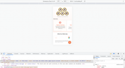
Here, you can easily test your website usability, functions, and user-friendliness for mobile devices for different screen resolutions from here. You can track your website load on the browser through the network and performance tabs that can help you to take necessary actions.
Using a Mobile Phone
The most straightforward and easy way to test your website for mobile-friendliness is simply testing it on a mobile device. It may sound simple but it is important to test your site from the users’ perspective. It will give you an idea about how your website actually feels and performs on devices with smaller screens.
It doesn’t include any complicated steps, just open a browser on your mobile device and enter your website URL to start testing. Check if any of the website content or elements are missing, or cut off from any side. Also, make sure that the navigation menu works perfectly.
Overall, make sure that it is easy for the users to read your content and navigate through your website on their mobile devices with minimum effort.

Create Mobile-Friendly Website: 7 Best Practices
Now, you must have understood the importance of a mobile-friendly site in 2022 where the number of smartphone users is greater than ever. While designing a new website from scratch, it is always better to design it while keeping mobile devices in mind that later can be optimized for other screen sizes.
However, it can be a daunting task to optimize your already desktop-friendly website for mobile devices when you are not a tech-savvy person. Here are some of the best practices that you must follow to make sure your site runs smoothly, without any error, across mobile devices.
Create Responsive Web Design

Responsive web design can adjust itself accordingly in the best possible way to fit the screen size across multiple devices. It can cover the majority of the devices and can work flawlessly. In the case of web responsive websites, all the site data and content including the HTML remains the same as it uses dynamic CSS rules based on the browser.
You can convert your existing website into a responsive one using a number of ways. Implementing a responsive website theme and implementing CSS3 media queries are some of the most convenient ways to do that.
Get Rid of a Bulky Navigation Bar

A navigation bar is one of the most common ways to allow users to easily navigate through your website. However, in the case of mobile devices, it can go against the user experience by covering a major part of the screen on the landing page.
The most common solution to this is replacing it with a hamburger menu. It allows drawing the actual navigation menu from a side of the screen by replacing the bulky navigation bar with a small button. This can help you to improve user experience and show relevant engaging content on the landing page to minimize the bounce rate.
Improve Site Loading Speed

Your desktop site might have scripts and functions that are redundant for the mobile device. This is why optimizing your content for mobile devices becomes crucial in order to achieve optimum site load speed. Improving your site loading speed can have cascading effects on both the user experience and SEO.
You can minify HTML and CSS codes and remove the ones that are no longer needed for mobile devices. Complex scripts can hit hard on the loading speeds of low-end devices and thus reducing such scripts from the webpage can help you to improve loading speed and user experience.
Optimize Content for Mobile Devices

Bulky media content may take time to load in case of slow internet connections. Also, it adds an extra load on the browsers to render the content on the screen. High-resolution images may no longer be required for mobile devices with smaller screen sizes as compared to desktop devices.
You can reduce the size of the content by compressing them to smaller sizes and that can work like a charm by improving your loading speed on mobile devices. Lazy-loading is another effective method to avoid the browser loading unwanted images before they are required.
In the case of text content, you can reduce the paragraph size to improve users’ reading experience and audience engagement. Also, make sure that your text is readable and not too small forcing the user to zoom in to read. You can even add accordions to show or hide content for a better user experience.
Remove Distracting Pop-ups

Pop-ups, however effective on desktop devices, can annoy mobile users and can greatly increase your bounce rates. Google calls them “intrusive interstitials,” and considers them as a negative factor while determining the page rank.
Therefore, you must eliminate all the pop-ups from your website to improve your site experience and Google ranking.
Optimize Forms for Mobile Devices

Forms may look long and boring on mobile devices as compared to desktop devices due to smaller screen sizes. Long forms on your website can annoy the users and may increase the probability of users bouncing back from your website. Therefore, it is essential to shorten the forms with minimum fields to make them less annoying.
Ask for only essential and important information from your users to reduce the form size. You can merge multiple fields for First, Middle, and Second names into a single field of “Full Name”. The same thing can also be done for the address. Furthermore, you can break down the forms into multiple parts and present the same to the user in multiple steps.
Provide a Search Option & Sitemaps

Providing a search button & sitemaps on a website is another important way to improve the user experience. However, the search option is not necessary for all kinds of websites, it becomes mandatory for websites such as eCommerce stores where it can help the customer to find the product he is looking for. It improves site navigation and allows the user to quickly find what he is looking for.
Sitemaps help Google to crawl the website easily. It also helps the customers to easily navigate through your website.
Conclusion
Considering the ever-growing number of hand-held devices with omnipresent internet connection facilities, the number of mobile internet users is dominating over desktop internet users. It becomes a necessity for online business owners and website users to make their website mobile-friendly to cover the ever-growing audience base of mobile internet users.
Every online website owner must understand the importance of building a mobile-friendly website to get the most out of their online business.
Here, we have covered some of the importance of a mobile-friendly website that will help you to thoroughly understand the concept and its necessity. You can also find some of the important actions required to make your site mobile-friendly here.
Image credits: http://meetanshi.com/
Mobile phone users have grown exponentially in the last decade and so does the importance of a mobile-friendly website. According to one report by Statista, the total number of smartphone users has surpassed 6 billion across the world. The number of handheld devices is even expected to rise further by a few billion in the upcoming years. Also, the number of mobile internet users is expected to rise in the upcoming years owing to immense digitalization.
Forbes report revealed a strange statistic about the number of mobile phone users, it stated that more people have access to mobile phones than to toilets! In such a scenario, we cannot deny calling the present era – “The era of smartphones”. Smartphones have totally changed lives right from shopping habits to making doctor appointments. The number of people browsing the internet right from mobile devices is greater than ever.
As per one report by Oberlo, 56.75% of all internet traffic comes from mobile devices. Therefore, in such a scenario, it becomes a necessity for the online store owners to focus on targeting mobile devices as well when a major part of the traffic is from mobile devices. This is where building a mobile-friendly site can help.
Here we have compiled complete details about mobile-friendly sites that will help you to clear some of your common doubts such as What is a mobile-friendly site? Why is it important to have a mobile-friendly website? etc.What is the Importance of a Mobile-Friendly Website [2022]?
As the name suggests, a mobile-friendly website works perfectly on mobile devices without any flaws in the user experience. It refers to a website that is highly responsive and adjusts itself to best fit mobile devices’ screen size. It enables mobile users to navigate through your website on their mobile phones without compromising the quality.
Earlier, website developers used to develop websites keeping the desktop users in mind, however, the tables seem to have turned now. There are more mobile phone internet users than those surfing on desktops.
The importance of a mobile-friendly website arose along with the search traffic from mobile devices. Also, desktop websites can look too small on mobile devices and can make it hard for mobile users to navigate through the site. Moreover, Google also considers mobile-friendly content and website first and is switching to mobile-first indexing for rank determination. This is why a mobile-friendly website is important from the digital marketing and SEO perspective.
Mobile-friendliness has become an important factor for determining Google page ranks in the past few years. A mobile-friendly website can benefit you in a variety of ways, it can improve your site’s visibility, cover a wider range of audiences & improve user experience, improve SEO scores, boost conversions, and can help you stand out from the crowd by making a difference.
In a nutshell, there are a plethora of benefits of having a mobile-friendly website. Provided below are the points describing the importance of having a mobile-friendly website:
- SEO Benefits due to Google’s mobile-first indexing
- Increase rate of mobile login customers
- The increasing number of mobile devices
- Building brand credibility
- Increased lead generation
- Improve user experience
- Cover a wider range of audience
- Give a modern & relevant look
How to Check if Your Website is Mobile-Friendly?
Now, you might have understood what a Mobile-friendly site is and why it is important to have a mobile-friendly website. It is time to check if your website is Mobile-friendly or not. There are multiple ways to do that. Provided here are some of the convenient ways to test your website for mobile devices.
Run Google Mobile-Friendly Test
The easiest and most convenient method to test your website for mobile-friendliness is through Google’s mobile-friendly test. It tests how easily a visitor can use and navigate through your website. Also, it is one of the highly preferable methods to check the mobile-friendliness of your site as it uses Googlebot smartphone to test your site. Once you get your website pass through Google’s mobile-friendly test, it will start getting the benefits of Google’s mobile-first indexing and will help you to rank better.
Follow the simple steps provided below to check your site’s mobile friendliness.
- Step 1: Visit https://search.google.com/test/mobile-friendly on your browser.
- Step 2: Now, enter your website address in the text box, for e.g. www.meetanshi.com.
- Step 3: Hit the ‘Test URL’ button to run the test & wait for a minute or two to get your result.
Image Source: Google
The test result will show up on your screen. You can also check the mobile-friendliness of your entire website through the Google Search Console.
Using Google Chrome DevTools
Google chrome is one of the dominating website browsers in the market with a market share of 64.73% worldwide. It allows simulating mobile devices through DevTools to check the webpages along with real-time editing. It becomes the first choice for the website developers who want to test their website for mobile devices along with HTML & CSS live changes.
Moreover, it also provides an option to choose from a variety of devices to simulate. You can even customize screen resolution, rotate the device, and enable CPU throttling to simulate low-end devices.
Follow the below-mentioned steps to simulate and test the mobile website in your chrome browser.
- Step 1: Visit the website you want to test on your desktop Chrome browser, for e.g. www.meetanshi.com.
- Step 2: Once the site finishes loading, press “F12” or “Ctrl + Shift + i” to open the Chrome DevTools.
- Step 3: The Chrome DevTools will open displaying rendered HTML and CSS. Now, click on the Toggle device toolbar icon on the top-left corner of the DevTools section or press “Ctrl + Shift + m” to simulate a mobile device.
Here, you can easily test your website usability, functions, and user-friendliness for mobile devices for different screen resolutions from here. You can track your website load on the browser through the network and performance tabs that can help you to take necessary actions.
Using a Mobile Phone
The most straightforward and easy way to test your website for mobile-friendliness is simply testing it on a mobile device. It may sound simple but it is important to test your site from the users’ perspective. It will give you an idea about how your website actually feels and performs on devices with smaller screens.
It doesn’t include any complicated steps, just open a browser on your mobile device and enter your website URL to start testing. Check if any of the website content or elements are missing, or cut off from any side. Also, make sure that the navigation menu works perfectly.
Overall, make sure that it is easy for the users to read your content and navigate through your website on their mobile devices with minimum effort.
Create Mobile-Friendly Website: 7 Best Practices
Now, you must have understood the importance of a mobile-friendly site in 2022 where the number of smartphone users is greater than ever. While designing a new website from scratch, it is always better to design it while keeping mobile devices in mind that later can be optimized for other screen sizes.
However, it can be a daunting task to optimize your already desktop-friendly website for mobile devices when you are not a tech-savvy person. Here are some of the best practices that you must follow to make sure your site runs smoothly, without any error, across mobile devices.
Create Responsive Web Design
Responsive web design can adjust itself accordingly in the best possible way to fit the screen size across multiple devices. It can cover the majority of the devices and can work flawlessly. In the case of web responsive websites, all the site data and content including the HTML remains the same as it uses dynamic CSS rules based on the browser.
You can convert your existing website into a responsive one using a number of ways. Implementing a responsive website theme and implementing CSS3 media queries are some of the most convenient ways to do that.
Get Rid of a Bulky Navigation Bar
A navigation bar is one of the most common ways to allow users to easily navigate through your website. However, in the case of mobile devices, it can go against the user experience by covering a major part of the screen on the landing page.
The most common solution to this is replacing it with a hamburger menu. It allows drawing the actual navigation menu from a side of the screen by replacing the bulky navigation bar with a small button. This can help you to improve user experience and show relevant engaging content on the landing page to minimize the bounce rate.
Improve Site Loading Speed
Your desktop site might have scripts and functions that are redundant for the mobile device. This is why optimizing your content for mobile devices becomes crucial in order to achieve optimum site load speed. Improving your site loading speed can have cascading effects on both the user experience and SEO.
You can minify HTML and CSS codes and remove the ones that are no longer needed for mobile devices. Complex scripts can hit hard on the loading speeds of low-end devices and thus reducing such scripts from the webpage can help you to improve loading speed and user experience.
Optimize Content for Mobile Devices
Bulky media content may take time to load in case of slow internet connections. Also, it adds an extra load on the browsers to render the content on the screen. High-resolution images may no longer be required for mobile devices with smaller screen sizes as compared to desktop devices.
You can reduce the size of the content by compressing them to smaller sizes and that can work like a charm by improving your loading speed on mobile devices. Lazy-loading is another effective method to avoid the browser loading unwanted images before they are required.
In the case of text content, you can reduce the paragraph size to improve users’ reading experience and audience engagement. Also, make sure that your text is readable and not too small forcing the user to zoom in to read. You can even add accordions to show or hide content for a better user experience.
Remove Distracting Pop-ups
Pop-ups, however effective on desktop devices, can annoy mobile users and can greatly increase your bounce rates. Google calls them “intrusive interstitials,” and considers them as a negative factor while determining the page rank.
Therefore, you must eliminate all the pop-ups from your website to improve your site experience and Google ranking.
Optimize Forms for Mobile Devices
Forms may look long and boring on mobile devices as compared to desktop devices due to smaller screen sizes. Long forms on your website can annoy the users and may increase the probability of users bouncing back from your website. Therefore, it is essential to shorten the forms with minimum fields to make them less annoying.
Ask for only essential and important information from your users to reduce the form size. You can merge multiple fields for First, Middle, and Second names into a single field of “Full Name”. The same thing can also be done for the address. Furthermore, you can break down the forms into multiple parts and present the same to the user in multiple steps.
Provide a Search Option & Sitemaps
Providing a search button & sitemaps on a website is another important way to improve the user experience. However, the search option is not necessary for all kinds of websites, it becomes mandatory for websites such as eCommerce stores where it can help the customer to find the product he is looking for. It improves site navigation and allows the user to quickly find what he is looking for.
Sitemaps help Google to crawl the website easily. It also helps the customers to easily navigate through your website.
Conclusion
Considering the ever-growing number of hand-held devices with omnipresent internet connection facilities, the number of mobile internet users is dominating over desktop internet users. It becomes a necessity for online business owners and website users to make their website mobile-friendly to cover the ever-growing audience base of mobile internet users.
Every online website owner must understand the importance of building a mobile-friendly website to get the most out of their online business.
Here, we have covered some of the importance of a mobile-friendly website that will help you to thoroughly understand the concept and its necessity. You can also find some of the important actions required to make your site mobile-friendly here.
Image credits: http://meetanshi.com/
You must be logged in to post a comment.
- Most Recent
- Most Relevant
