 Notification
 Newbie
10 posts
Newbie
10 posts
Introduction: a few weeks ago I made a video (that you can show again at the bottom of this page) showing a way to make a splash screen (Poster image) for responsive projects. The picture used in this demonstration worked with all the screen sizes but wasn’t responsive. However I mentioned at the end of this video that it was possible to make a responsive splash screen by using Media Queries into the Css file.
I hadn’t explained it because it wasn’t the objective to make a Css lesson in this video, but for people interested, here is the step by step process to make a responsive splash screen with several pictures.
What is the main objective?
Instead of using one picture as shown in my “Customizing a splash screen for its customers and mobile / learning solutions” video, the objective here is to use and insert 3 pictures that will appear and change according to the size of the device or browser, like shown in this short video below:
— STEP BY STEP PROCESS —
Prerequisite
It is better to have already viewed the “Customizing a splash screen for its customers and mobile / learning solutions” video located at the bottom of this page or in the Video category.
 Step 1
Unlike shown in the video, don’t fill the “Auto Play” form field in the Start and End menu. Let it blank. Just uncheck the checkbox like below.
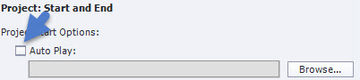
Notice: if you have already filled this field, there is no possibility to make it blank again (Captivate doesn’t allow it). So replace your current picture by a picture that is 1px wide and high in a transparent format. The aim is to put an invisible picture to replace yours.
Step 2
Once your Captivate project is completely finished, publish it to the HTML5 format.
Step 3
To enable your splash screen to be responsive you need to prepare several pictures with different sizes. As said at the beginning, I am going to use 3 different pictures for this presentation and as size for each one I am going to use the same than the ones used by Captivate into its Css file for its “gestureimage*.*.png”. That means:
- Mobile size: width:186px; height:350px
- Mobile Landscape size: width:335px; height:281px
- Tablet size: width:531px; height:277px
Do the same on your side by preparing 3 different pictures with the sizes above-mentioned (of course you can change these sizes or add pictures to your project if you have good knowledge of Media queries.)
Step 4
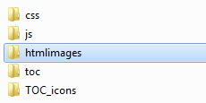
Once done go to the following path: “yourproject/assets/htmlimages” of your published project at Step 2, and insert your 3 pictures into the “htmlimages” folder.
Step 5
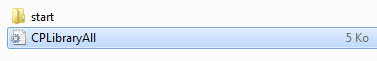
Go to the “css” folder (path: “yourproject/assets/css”) and open the “CpLibraryAll.css” file with a HTML or Css editor.
Step 6
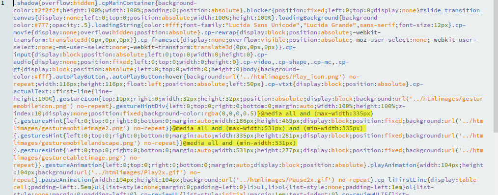
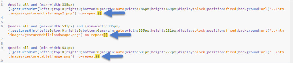
Within this file, 3 Media queries rules have been generated by default by Captivate. These Media queries rules begin by the following Css syntax: “@media”
(see yellow highlight in the picture below). Identify them into your file.
Step 7
Make these three Media Queries rules distinct like shown below in order to better edit the next steps.

Step 8
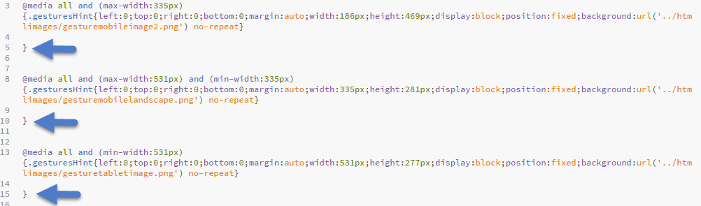
Identify the double braces that finish each rule,
and make two line breaks just before the last one. The result must be like below with a blank line between both.
Step 9
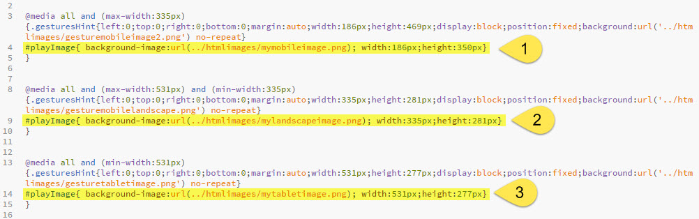
For each blank line, enter the following Css code (see also screenshot below) :
Code for line 1:
#playImage{background-image:url(../htmlimages/mymobileimage.png); width:186px;height:350px}
Code for line 2:
#playImage{background-image:url(../htmlimages/mylandscapeimage.png); width:335px;height:281px}
Code for line 3:
#playImage{background-image:url(../htmlimages/mytabletimage.png); width:531px;height:277px}
Once done replace the name of the “png” picture by yours. Moreover if you haven’t used the same size than me, change also their width and height values).
Notice: “# playImage” is the css ID of the picture.
Step 10
Save your css file.
Step 11
Launch your “index.html” file and check out the result in your browser by resizing it. You should see your three different pictures that appear and change according to the size of your browser like shown in the video at the top of the page.
 END OF THE PROCESS
CONCLUSION / NOTICE
1 – By default Captivate generates three types of Media queries but if you have good knowledge of Css and Media queries you can add others.
2 – This article only describes how to make a responsive splash screen with different pictures. It doesn’t describe the whole process shown in the video below, like the way we hide the picture of the arrow, the customization of the background and the loading page, as other tricks.
So if you want to get a complete overview of how to make a splash screen for mobile and tablet solutions, don’t hesitate to look at this complete video. A teaching aid made with fluid boxes is used.
Introduction: a few weeks ago I made a video (that you can show again at the bottom of this page) showing a way to make a splash screen (Poster image) for responsive projects. The picture used in this demonstration worked with all the screen sizes but wasn’t responsive. However I mentioned at the end of this video that it was possible to make a responsive splash screen by using Media Queries into the Css file.
I hadn’t explained it because it wasn’t the objective to make a Css lesson in this video, but for people interested, here is the step by step process to make a responsive splash screen with several pictures.
What is the main objective?
Instead of using one picture as shown in my “Customizing a splash screen for its customers and mobile / learning solutions” video, the objective here is to use and insert 3 pictures that will appear and change according to the size of the device or browser, like shown in this short video below:
— STEP BY STEP PROCESS —
Prerequisite
It is better to have already viewed the “Customizing a splash screen for its customers and mobile / learning solutions” video located at the bottom of this page or in the Video category.
Step 1
Unlike shown in the video, don’t fill the “Auto Play” form field in the Start and End menu. Let it blank. Just uncheck the checkbox like below.
Notice: if you have already filled this field, there is no possibility to make it blank again (Captivate doesn’t allow it). So replace your current picture by a picture that is 1px wide and high in a transparent format. The aim is to put an invisible picture to replace yours.
Step 2
Once your Captivate project is completely finished, publish it to the HTML5 format.
Step 3
To enable your splash screen to be responsive you need to prepare several pictures with different sizes. As said at the beginning, I am going to use 3 different pictures for this presentation and as size for each one I am going to use the same than the ones used by Captivate into its Css file for its “gestureimage*.*.png”. That means:
- Mobile size: width:186px; height:350px
- Mobile Landscape size: width:335px; height:281px
- Tablet size: width:531px; height:277px
Do the same on your side by preparing 3 different pictures with the sizes above-mentioned (of course you can change these sizes or add pictures to your project if you have good knowledge of Media queries.)
Step 4
Once done go to the following path: “yourproject/assets/htmlimages” of your published project at Step 2, and insert your 3 pictures into the “htmlimages” folder.
Step 5
Go to the “css” folder (path: “yourproject/assets/css”) and open the “CpLibraryAll.css” file with a HTML or Css editor.
Step 6
Within this file, 3 Media queries rules have been generated by default by Captivate. These Media queries rules begin by the following Css syntax: “@media”
(see yellow highlight in the picture below). Identify them into your file.
Step 7
Make these three Media Queries rules distinct like shown below in order to better edit the next steps.
Step 8
Identify the double braces that finish each rule,
and make two line breaks just before the last one. The result must be like below with a blank line between both.
Step 9
For each blank line, enter the following Css code (see also screenshot below) :
Code for line 1:
#playImage{background-image:url(../htmlimages/mymobileimage.png); width:186px;height:350px}
Code for line 2:
#playImage{background-image:url(../htmlimages/mylandscapeimage.png); width:335px;height:281px}
Code for line 3:
#playImage{background-image:url(../htmlimages/mytabletimage.png); width:531px;height:277px}
Once done replace the name of the “png” picture by yours. Moreover if you haven’t used the same size than me, change also their width and height values).
Notice: “# playImage” is the css ID of the picture.
Step 10
Save your css file.
Step 11
Launch your “index.html” file and check out the result in your browser by resizing it. You should see your three different pictures that appear and change according to the size of your browser like shown in the video at the top of the page.
END OF THE PROCESS
CONCLUSION / NOTICE
1 – By default Captivate generates three types of Media queries but if you have good knowledge of Css and Media queries you can add others.
2 – This article only describes how to make a responsive splash screen with different pictures. It doesn’t describe the whole process shown in the video below, like the way we hide the picture of the arrow, the customization of the background and the loading page, as other tricks.
So if you want to get a complete overview of how to make a splash screen for mobile and tablet solutions, don’t hesitate to look at this complete video. A teaching aid made with fluid boxes is used.
You must be logged in to post a comment.
- Most Recent
- Most Relevant
Thank you for this information, we used mobile app development service to get this done, but this works!!
Thank you for the instruction. I work in the mobile gaming industry and I frequently use this method to get things done.
<a href=”https://www.daisoftware.com/Products/On-Demand-App-Development” title=”on-demand mobile app development company”>on-demand mobile app development company</a>
Below is a complete tutorial. Please feel free to modify, fix, or amend it according to your needs, or give a pull request to our main branch.
Implementation
We can do the whole thing by simply using the HTML5 Canvas .
Short:
tag.
Responsioning a 500×200 image (logo) to fit to the page.
$InputImage = ImageCreateFromGif ( “poster_img.gif” ) ;
$RespImage = ImageCreateTrueColor ( 500 , 200 ) ;
ImageResize ( $RespImage , $InputImage ) ;
ImagePNG ( $RespImage ) ;
ImageDestroy ( $RespImage ) ;
?>
Long response:
tag.
$InputImage = ImageCreateFromGif ( “poster_img.gif” ) ;
$RespImage = ImageCreateTrueColor (
We call this a poster:
It’s the simplest use of responsive design: a large format image that shows the look and feel of an app. You can adapt it to reproduce the look of a responsive page with multiple columns.
Here’s the basic file structure for a splash:
– index.html
– background.png
– imagepng
– imagepng
– imagepng
– three_cols.html
Each file contains the HTML to display just one image. The HTML for a single, large image looks like this:
Lovely and very informative article! Good job.
Thanks for the tutorial. I work in the mobile gaming industry and I often used this method to work.
Thank you for the article! I`m agree with Tanc14, but in my opinion more useful information you can find here: https://webmeridian.org/want-to-improve-performance-of-your-magento-shop/
The first impression is what the splash screen provides when it comes to design. it is equally important when it comes to website design as it can make or break the custom connection. You should definitely interview the best website agencies before you go full-fledged hiring phase.
Great interactivity!
Get Tutorials! @Jullien
Nice piece JM!
I have some useful points how to splash screen implementation – https://www.cleveroad.com/blog/mobile-app-splash-screen-reasons-to-integrate-launch-screen-into-your-app
Outstanding way to make a great, professional first impression on clients and learners! Many thanks to you for such an inclusive (procedural and visual) tutorial- Works perfectly!
thank you Kirk.
Thank you Jean for sharing this helpful article.
You’re welcome. Thank you for appreciating.
