The easy way to add extra states to your project that will save you time and money and give you more interactivity for your learners.
Using Captivate States to make your project more interactive
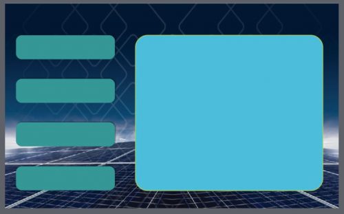
In this blog, I want to show you how simple it is to use the “object states” option in Captivate. This can save you a lot of time and effort when designing your eLearning projects. This can be used for as many buttons or smart shapes as you need. For instance, you could have the alphabet across the top of the screen and when you click on each letter it will take you to information about that letter. Below is the project we will be creating:
We have four smart shapes converted to buttons and one main container that we will add four states to so that we have a default state as in the image above and four states that can display other information, shapes, images or audio and video when a shape is clicked on. So let us see how we can make this happen?

Step 1:
We need to have a new slide to place our objects on, so we start with our 1024px x 627px slide this works best for most situations. On this screen, we can place our four smart shapes that will be converted to buttons and a fifth smart shape to act as our main container.
Step 2:
Next, we will name all of our assets this will make it easier to work with at a later stage. We will name the large shape as Main_Container and the four other shapes as SmartShape_1, SmartShape_2, SmartShape_3, SmartShape_4.


Double click in each smart shape and add the names here as well:

Step 3:
Now we need to add four new states to the main container so that we can add our extra information for each of the four smart shapes. To do this click on the main container shape and then click on properties and then on state view as in the image below:
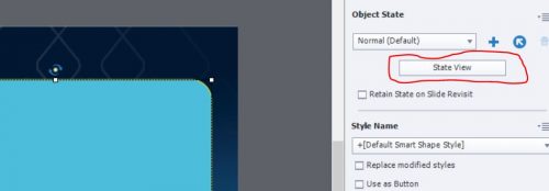
Once you have clicked on state view you will get the following as in the image below:
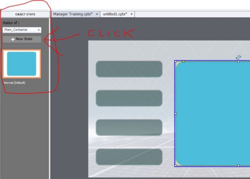
Now click on add new state and give it the name NewState_2:
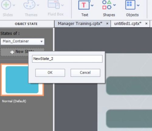
Repeat this for the other three states naming them NewState_3, NewState_4 and NewState_5. You should have something similar to the image below:
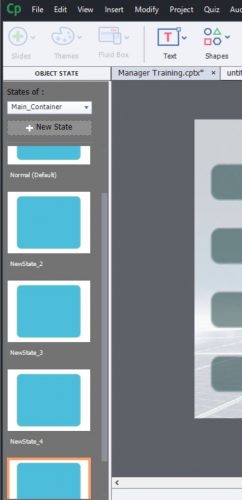
At this stage, you can go back to each state and change the text, colours, images video, etc. Each is an individual state and you can add or delete information.
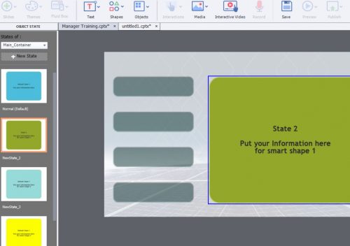
Now click on exit state view:

Step 4:
Now we need to add our states to each button, we do this by selecting each button and making some changes to the actions panel,
We will add an action to happen when the shape is clicked and we will also add a hand cursor so that the learner knows that the shape is clickable:
click on button marked “A”, then click on Actions “B” and then on “On Success” “C”:
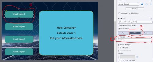
click on the use as button tick box, then click on the drop-down selection “C” and select Change State Of and this will display another selection box below “D”
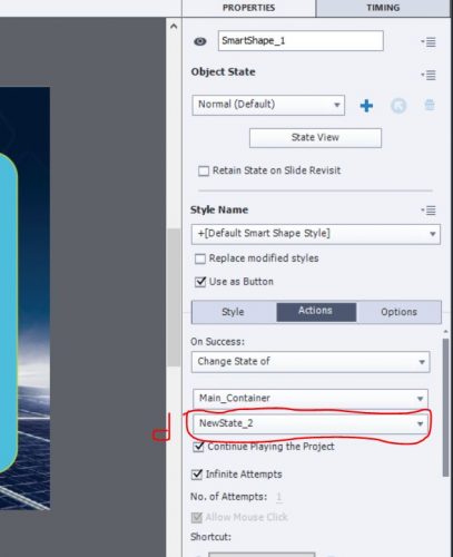
In this drop select NewState_2. Now scroll down and select Hand Cursor, you can also select if this is to be a double click shape or single and you can disable or turn off the click sound here as well.
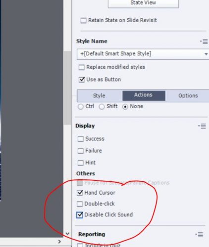
Now just repeat step 4 for the remaining three smart shapes.
That’s it, you have now completed a working smart shape that has five individual states and you can have more or less states depending on your requirements for your project.

I hope this helps some of you to implement states in your projects.
Using Captivate States to make your project more interactive
In this blog, I want to show you how simple it is to use the “object states” option in Captivate. This can save you a lot of time and effort when designing your eLearning projects. This can be used for as many buttons or smart shapes as you need. For instance, you could have the alphabet across the top of the screen and when you click on each letter it will take you to information about that letter. Below is the project we will be creating:
We have four smart shapes converted to buttons and one main container that we will add four states to so that we have a default state as in the image above and four states that can display other information, shapes, images or audio and video when a shape is clicked on. So let us see how we can make this happen?

Step 1:
We need to have a new slide to place our objects on, so we start with our 1024px x 627px slide this works best for most situations. On this screen, we can place our four smart shapes that will be converted to buttons and a fifth smart shape to act as our main container.

Step 2:
Next, we will name all of our assets this will make it easier to work with at a later stage. We will name the large shape as Main_Container and the four other shapes as SmartShape_1, SmartShape_2, SmartShape_3, SmartShape_4.


Double click in each smart shape and add the names here as well:

Step 3:
Now we need to add four new states to the main container so that we can add our extra information for each of the four smart shapes. To do this click on the main container shape and then click on properties and then on state view as in the image below:

Once you have clicked on state view you will get the following as in the image below:

Now click on add new state and give it the name NewState_2:

Repeat this for the other three states naming them NewState_3, NewState_4 and NewState_5. You should have something similar to the image below:

At this stage, you can go back to each state and change the text, colours, images video, etc. Each is an individual state and you can add or delete information.

Now click on exit state view:

Step 4:
Now we need to add our states to each button, we do this by selecting each button and making some changes to the actions panel,
We will add an action to happen when the shape is clicked and we will also add a hand cursor so that the learner knows that the shape is clickable:
click on button marked “A”, then click on Actions “B” and then on “On Success” “C”:

click on the use as button tick box, then click on the drop-down selection “C” and select Change State Of and this will display another selection box below “D”

In this drop select NewState_2. Now scroll down and select Hand Cursor, you can also select if this is to be a double click shape or single and you can disable or turn off the click sound here as well.

Now just repeat step 4 for the remaining three smart shapes.
That’s it, you have now completed a working smart shape that has five individual states and you can have more or less states depending on your requirements for your project.

I hope this helps some of you to implement states in your projects.
You must be logged in to post a comment.
- Most Recent
- Most Relevant
I am preparing a blog post explaining the big difference between InBuilt states and Custom states. In this blog you do not mention that difference, which is causing lot of confusion for some users. It is a pity that you didn’t mention you are only talking about custom states. States are very important as alternatives for the former Show/Hide process in the case of fluid boxes projects as well.


