Use case to explain how clickable area can be controlled when using SVG’s as buttons
Intro
In previous posts I have talked about the advantages and disadvantages of the new button types, and how you can edit the colors of SVG’s, even in states when they are used as buttons. SVG’s, because they are vector images are excellent for use in projects that may be viewed on multiple devices, whether it is a Scalable non-responsive or a responsive project.
What is unique about SVG’s used as buttons, is the fact that you have control over the clickable area, which is not the case for other types of buttons. In the example you’ll see buttons which would have been impossible with another type.
Example file
Watch this two-slide project. The Title slide is taken from the QSP ‘Legacy’ (non-responsive), but I have changed fonts (not fan of Arial). The second slide uses an edited master slide from that same QSP. Click the buttons in circular image in any sequence, and you can also reset the slide (used the Scenario 2 technique described in Replay Slide)
Setup Clickable Area
Six Buttons
The 6 buttons in the circular arrangement have overlapping bounding boxes. Have a look at this screenshot:
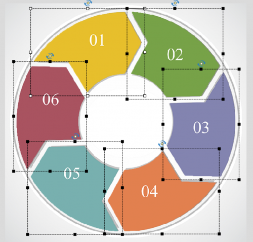
By unchecking the option ‘Enable Click in Bounding Box’ the clickable area will be limited to the colored buttons, and do not overlap anymore.

InBuilt states of the buttons are limited to the Normal and Visited state. In the Visited state I used an icon (also SVG) from the Assets panel, which I colored in the same color of the button which was dimmed. That icon also covered up the number, which was part of the button SVG. Here is the Object state panel for button 6:
Reset Button
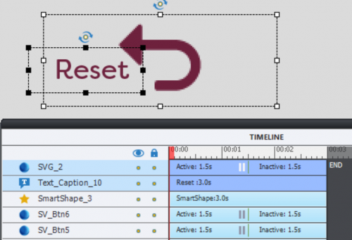
For this button I used an icon from the Assets panel. I added a text caption under this button and extended the bounding box of the SVG so that the Reset text was inside. In this case I kept the default option under the Style tab ‘Enable Click in Bounding Box’. It now looks as if the learner can click both text and icon.
Other Items
The information is stored in a multistate shape, where the Normal state is invisible (Alpha and Stroke set to 0). A two state shape is used for the final image, which is in a custom state of a circular shape. That circular shape also has an invisible Normal state.
For the multistate objects the option ‘Retain State on Slide Revisit’ remains unchecked. Since the Reset button is re-entering the slide, all multistate objects will automatically revert to their Normal states.
Actions and variables were custom made, I didn’t use any of the click-reveal interactions from the QSP’s. Sorry about that, but I’m so used to create that type of interactivity that it comes almost naturally. No testing needed.
Intro
In previous posts I have talked about the advantages and disadvantages of the new button types, and how you can edit the colors of SVG’s, even in states when they are used as buttons. SVG’s, because they are vector images are excellent for use in projects that may be viewed on multiple devices, whether it is a Scalable non-responsive or a responsive project.
What is unique about SVG’s used as buttons, is the fact that you have control over the clickable area, which is not the case for other types of buttons. In the example you’ll see buttons which would have been impossible with another type.
Example file
Watch this two-slide project. The Title slide is taken from the QSP ‘Legacy’ (non-responsive), but I have changed fonts (not fan of Arial). The second slide uses an edited master slide from that same QSP. Click the buttons in circular image in any sequence, and you can also reset the slide (used the Scenario 2 technique described in Replay Slide)
Setup Clickable Area
Six Buttons
The 6 buttons in the circular arrangement have overlapping bounding boxes. Have a look at this screenshot:

By unchecking the option ‘Enable Click in Bounding Box’ the clickable area will be limited to the colored buttons, and do not overlap anymore.

InBuilt states of the buttons are limited to the Normal and Visited state. In the Visited state I used an icon (also SVG) from the Assets panel, which I colored in the same color of the button which was dimmed. That icon also covered up the number, which was part of the button SVG. Here is the Object state panel for button 6:
Reset Button
For this button I used an icon from the Assets panel. I added a text caption under this button and extended the bounding box of the SVG so that the Reset text was inside. In this case I kept the default option under the Style tab ‘Enable Click in Bounding Box’. It now looks as if the learner can click both text and icon.

Other Items
The information is stored in a multistate shape, where the Normal state is invisible (Alpha and Stroke set to 0). A two state shape is used for the final image, which is in a custom state of a circular shape. That circular shape also has an invisible Normal state.
For the multistate objects the option ‘Retain State on Slide Revisit’ remains unchecked. Since the Reset button is re-entering the slide, all multistate objects will automatically revert to their Normal states.
Actions and variables were custom made, I didn’t use any of the click-reveal interactions from the QSP’s. Sorry about that, but I’m so used to create that type of interactivity that it comes almost naturally. No testing needed.
You must be logged in to post a comment.
- Most Recent
- Most Relevant
I have created a similar graphic. I followed your steps precisely and when I preview my captivate file, using html5, it still functions as if the bounding boxes are in place. Even when I uncheck “Enable Click in Bounding Box” the svg buttons can only be clicked on in places where the bounding boxes are not overlapping. Could it be a result of the text caption being integrated into the multi-state object? The only two states I use are Normal and Visited. Any insight would be greatly appreciated.

