Second part, describing the Shape button, Bitmap used as button, SVG used as button. At the end you’ll find my conclusion about using button types.
Newer Button types
In the first part you have explored the old types of buttons: Text button, Transparent Button and Image button. From my comments you detect that I only use Transparent buttons on quiz slides and score slide, but very rarely the other types. Reason is that since they appeared with Captivate 6 I always used Shape buttons. With the most recent release, 11.5, two new possibilities were added: using bitmap images, or SVG’s as buttons. I know, in the release notes they only talk about images used as buttons, but there is a considerable difference between bitmap image buttons and SVG buttons. That is the new trio of buttons, topic of this post.
Common features
You did read in Part 1 about the common features for all buttons, and those common to all the three older button types. These are the common features for the newer buttons:
- They can be used on master slides. Those will not have an ID, cannot be controlled by actions.
- They can be timed for the rest of the project. That way you create one button with a unique ID which can be controlled (Hide/Show, Enable/Disable)
- They can not be used as embedded buttons on quiz and score slides.
- They can be used as extra (custom) button on a quiz or a score slide.
This list is not as long as for the old trio. To see specific features for each type continue reading.
Shape Button
A smart shape with the option “Use as button’ checked in its Properties, is not so new anymore. Since many years my number 1. Why? Have a look at this 7 years old blog post: “Why I like Shape Buttons“. I even presented several webinars for Adobe about this type of button.
Such a shape button has some features taken over from the old trio:
- Its timeline is green. A Smart shape has a blue timeline, which turns green when you check the option ‘Use as button’, identifying it as an interactive object.
- Shapes have multiple default object styles, which you can check/define in the Object Style Manager. However you do not see a default style for a Shape button. Since any shape can be used as a button, each of the styles has the InBuilt states Normal, Rollover and Down (not Visited) included. Similar to all object styles shape (buton) styles will be included in the (custom) theme.
- They will not show up in the Library, are not available in the Assets panel neither.
Shape button has also some similarities to the Transparent button, concerning the style: you can fill a shape with a solid color, a gradient, a texture or an image. You can also indicate color and width of the stroke. But, a shape button can have any shape, transparent buttons are limited to rectangle and rounded rectangle shape. This is even valid for the states: you can switch to another shape in the InBuilt or custom states. Only rule is that the original bounding box location/size of the Normal state has to be preserved. Look at the Object state panel of (maybe too exaggerated style) of this shape button:
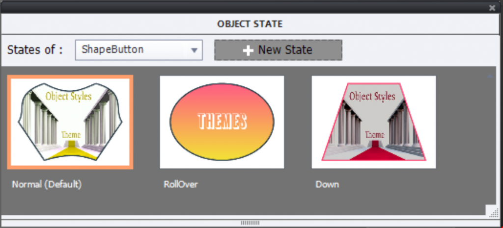
Personally I appreciate also the fact that the label can be typed in the shape, you don’t need to use the Properties panel (Text and Transparent button). I defined an object style for this button. It will include the edited image (Normal and Down state), the gradient and the text style for the Rollover state, and all strokes. Object style will not have the different shapes (Normal state is a freeform shape).
Shape button is the only button type which will allow Copy/Paste appearance as well! Read more in Copy/Paste Appearance.
If you are not yet convinced that this a very flexible type of button, look at the common features for the three buttons in this post.
Here are some minus points:
- If you want the shape to be filled with an image, only bitmap images can be used (as for trnasparent buttons). To have a crisp looking image, create it in exactly the same size as the shape button. More details in ‘Turn an image into a button
- You will find no Shape buttons in the Library, only images if you used them s fill. I recommend to create a subfolder for images used in shape buttons. The Buttons section in the Assets panel neither has shape buttons.
- Shape buttons automatically shrink when pressed, trying to simulate a a real button. Some developers do not like that effect (which you’ll also see in the two other button types of this post). Mixed feelings: I don’t care about this feature, but not everyone agrees. It would have been better to leave the choice to the Captivate developer.
Bitmap image as Button
New type available since version 11.5. Instead of filling a shape with an image you can now convert a bitmap image (PNG, JPEG, GIF…) directly to a button. Just check the option in the Properties panel. You’ll see immediately that the default three InBuilt states appear in the panel:
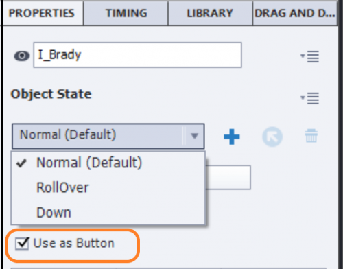
You can swap images in the states, using the button indicated in this screenshot by a red rounded rectangle. In this example I used three different images from the series Brady (Illustrated category). You can add a text container in each state, but it is not really embedded in the image itself, or you can choose an image which has text in the graphics. Here I just used the character images.
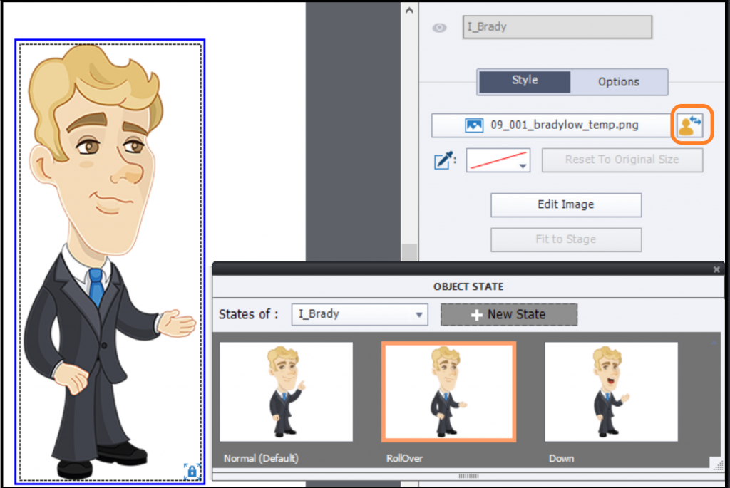
You cannot define an object style s.
If you open the Assets panel, you’ll find a group titled ‘Buttons’. All the buttons in this group are of this type. However, the three InBuilt states will show identical images. In a previous article about the Asset panel I offered a tip to make it possible to have different images show up when inserting a button from this panel. That make it a lot easier to reuse buttons from this type: insert them from the Assets panel.
Common features described at the start are valid for this type as well.
Features which are less appealing:
- Contrary to all buttons discussed before, this type keeps the blue timeline of any non-interactive object.
- It is a bitmap image, which means quality loss when rescaling. Rescaling happens for Rescalable HTML output and in responsive projects.
- Shrinking happens for this type as well, may be very visible (with simple buttons like the ones in the Asset panel) or barely visible for a big character button like I showed in the screenshots.
SVG as Button
I have already blogged about this type in the already mentioned blog with Tips for the Assets Panel, but also in “Edit SVG’s“. Up till now it has never been possible to use a SVG in an interactive object like a shape button or a transparent button. For the first time you can use a vector-based image as a button, which is great news for responsive projects and rescalable HTML5 projects. They share the common features with the two other types of this post.
SVG’s also may have a smaller file size than their bitmap counterparts. I have converted some png-files from the Characters, Illustrated category to SVG’s. File size reduced to about 30% of the png filesize.Look
At least as exciting is the fact that the clickable area for a SVG need NOT be the bounding box of the image. Look at the Properties panel:
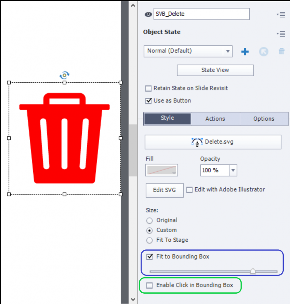
Watch the option ‘Fit to Bounding Box’, with the associated slider (blue rounded rectangle). In the default situation the slide will be at its maximum (to the right) which means the bounding box is filled with the SVG. I created some padding as you can see, by moving the slider to the left. The green rectangle indicates the option to define the clickable area. Default setting is ‘Enable Click’ which means the legacy situation where the bounding box is clickable everywhere. I unchecked it, and now the clickable area is limited to the SVG space. Expect in the near future to see a use case where this innovative feature will be used.
Similar to Bitmap image as button, no object styles are possible. The used SVG’s will appear in the Project Library. If you used the same SVG for each state its name will appear with a usage of 3 or more (if you have more states). For a more complicated image, I recommend to create the SVG’s separately (I use Illustrator) and import them to the Project Library. In this screenshot you see a Delete button, for which I used one of the provided Icons in the Assets panel, converted it to a button. But unlike the Bitmap images, there is no way to include a different image for the other InBuilt states.
Negative points:
- Like its twin (Bitmap as button), this type keeps the blue timeline of any non-interactive object. Should have turned green (logged feature request).
- Shrinking happens for this type as well,
- No easy way to reuse a SVG button with all its states.
Conclusion
Here are my personal conclusions:
- If I need a button which maintains a high quality image on many different screen resolutions use a SVG aton.
- If reusability of certain buttons is important, and I need to localize them as well, I will use a shape button except…
- For quiz and score slides as embedded buttons I have no choice but need to use Transparent buttons.
- I am not tempted by bitmaps as buttons, except for a rare complicated button. Even though it is bit more cumbersome, in all other situations will use a shape button filled with the image.
- I never use Text buttons.
- I only use an image button in that Tweak situation described in the first post.
Would love to hear your ideas!
Newer Button types
In the first part you have explored the old types of buttons: Text button, Transparent Button and Image button. From my comments you detect that I only use Transparent buttons on quiz slides and score slide, but very rarely the other types. Reason is that since they appeared with Captivate 6 I always used Shape buttons. With the most recent release, 11.5, two new possibilities were added: using bitmap images, or SVG’s as buttons. I know, in the release notes they only talk about images used as buttons, but there is a considerable difference between bitmap image buttons and SVG buttons. That is the new trio of buttons, topic of this post.
Common features
You did read in Part 1 about the common features for all buttons, and those common to all the three older button types. These are the common features for the newer buttons:
- They can be used on master slides. Those will not have an ID, cannot be controlled by actions.
- They can be timed for the rest of the project. That way you create one button with a unique ID which can be controlled (Hide/Show, Enable/Disable)
- They can not be used as embedded buttons on quiz and score slides.
- They can be used as extra (custom) button on a quiz or a score slide.
This list is not as long as for the old trio. To see specific features for each type continue reading.
Shape Button
A smart shape with the option “Use as button’ checked in its Properties, is not so new anymore. Since many years my number 1. Why? Have a look at this 7 years old blog post: “Why I like Shape Buttons“. I even presented several webinars for Adobe about this type of button.
Such a shape button has some features taken over from the old trio:
- Its timeline is green. A Smart shape has a blue timeline, which turns green when you check the option ‘Use as button’, identifying it as an interactive object.
- Shapes have multiple default object styles, which you can check/define in the Object Style Manager. However you do not see a default style for a Shape button. Since any shape can be used as a button, each of the styles has the InBuilt states Normal, Rollover and Down (not Visited) included. Similar to all object styles shape (buton) styles will be included in the (custom) theme.
- They will not show up in the Library, are not available in the Assets panel neither.
Shape button has also some similarities to the Transparent button, concerning the style: you can fill a shape with a solid color, a gradient, a texture or an image. You can also indicate color and width of the stroke. But, a shape button can have any shape, transparent buttons are limited to rectangle and rounded rectangle shape. This is even valid for the states: you can switch to another shape in the InBuilt or custom states. Only rule is that the original bounding box location/size of the Normal state has to be preserved. Look at the Object state panel of (maybe too exaggerated style) of this shape button:

Personally I appreciate also the fact that the label can be typed in the shape, you don’t need to use the Properties panel (Text and Transparent button). I defined an object style for this button. It will include the edited image (Normal and Down state), the gradient and the text style for the Rollover state, and all strokes. Object style will not have the different shapes (Normal state is a freeform shape).
Shape button is the only button type which will allow Copy/Paste appearance as well! Read more in Copy/Paste Appearance.
If you are not yet convinced that this a very flexible type of button, look at the common features for the three buttons in this post.
Here are some minus points:
- If you want the shape to be filled with an image, only bitmap images can be used (as for trnasparent buttons). To have a crisp looking image, create it in exactly the same size as the shape button. More details in ‘Turn an image into a button
- You will find no Shape buttons in the Library, only images if you used them s fill. I recommend to create a subfolder for images used in shape buttons. The Buttons section in the Assets panel neither has shape buttons.
- Shape buttons automatically shrink when pressed, trying to simulate a a real button. Some developers do not like that effect (which you’ll also see in the two other button types of this post). Mixed feelings: I don’t care about this feature, but not everyone agrees. It would have been better to leave the choice to the Captivate developer.
Bitmap image as Button
New type available since version 11.5. Instead of filling a shape with an image you can now convert a bitmap image (PNG, JPEG, GIF…) directly to a button. Just check the option in the Properties panel. You’ll see immediately that the default three InBuilt states appear in the panel:

You can swap images in the states, using the button indicated in this screenshot by a red rounded rectangle. In this example I used three different images from the series Brady (Illustrated category). You can add a text container in each state, but it is not really embedded in the image itself, or you can choose an image which has text in the graphics. Here I just used the character images.

You cannot define an object style s.
If you open the Assets panel, you’ll find a group titled ‘Buttons’. All the buttons in this group are of this type. However, the three InBuilt states will show identical images. In a previous article about the Asset panel I offered a tip to make it possible to have different images show up when inserting a button from this panel. That make it a lot easier to reuse buttons from this type: insert them from the Assets panel.
Common features described at the start are valid for this type as well.
Features which are less appealing:
- Contrary to all buttons discussed before, this type keeps the blue timeline of any non-interactive object.
- It is a bitmap image, which means quality loss when rescaling. Rescaling happens for Rescalable HTML output and in responsive projects.
- Shrinking happens for this type as well, may be very visible (with simple buttons like the ones in the Asset panel) or barely visible for a big character button like I showed in the screenshots.
SVG as Button
I have already blogged about this type in the already mentioned blog with Tips for the Assets Panel, but also in “Edit SVG’s“. Up till now it has never been possible to use a SVG in an interactive object like a shape button or a transparent button. For the first time you can use a vector-based image as a button, which is great news for responsive projects and rescalable HTML5 projects. They share the common features with the two other types of this post.
SVG’s also may have a smaller file size than their bitmap counterparts. I have converted some png-files from the Characters, Illustrated category to SVG’s. File size reduced to about 30% of the png filesize.Look
At least as exciting is the fact that the clickable area for a SVG need NOT be the bounding box of the image. Look at the Properties panel:

Watch the option ‘Fit to Bounding Box’, with the associated slider (blue rounded rectangle). In the default situation the slide will be at its maximum (to the right) which means the bounding box is filled with the SVG. I created some padding as you can see, by moving the slider to the left. The green rectangle indicates the option to define the clickable area. Default setting is ‘Enable Click’ which means the legacy situation where the bounding box is clickable everywhere. I unchecked it, and now the clickable area is limited to the SVG space. Expect in the near future to see a use case where this innovative feature will be used.
Similar to Bitmap image as button, no object styles are possible. The used SVG’s will appear in the Project Library. If you used the same SVG for each state its name will appear with a usage of 3 or more (if you have more states). For a more complicated image, I recommend to create the SVG’s separately (I use Illustrator) and import them to the Project Library. In this screenshot you see a Delete button, for which I used one of the provided Icons in the Assets panel, converted it to a button. But unlike the Bitmap images, there is no way to include a different image for the other InBuilt states.
Negative points:
- Like its twin (Bitmap as button), this type keeps the blue timeline of any non-interactive object. Should have turned green (logged feature request).
- Shrinking happens for this type as well,
- No easy way to reuse a SVG button with all its states.
Conclusion
Here are my personal conclusions:
- If I need a button which maintains a high quality image on many different screen resolutions use a SVG aton.
- If reusability of certain buttons is important, and I need to localize them as well, I will use a shape button except…
- For quiz and score slides as embedded buttons I have no choice but need to use Transparent buttons.
- I am not tempted by bitmaps as buttons, except for a rare complicated button. Even though it is bit more cumbersome, in all other situations will use a shape button filled with the image.
- I never use Text buttons.
- I only use an image button in that Tweak situation described in the first post.
Would love to hear your ideas!
You must be logged in to post a comment.
- Most Recent
- Most Relevant
That is weird, Kathy! Which version do you use? It makes no sense to need another interactive object on top of a shape, because that would make shape buttons unusable in Fluid Boxes projects. Have been using shape buttons since over 6 years (they appeared with release 6). Can you turn on the hand cursor, and see if it appears? Which shape did you use for the shape buttons?
Hi Lieve,
Yes, it has been very weird. I only started noticing it about 2 weeks ago. Well, in fact it was one of my users that noticed it.
I’m wondering if it is an issue with my LMS. I use Moodle to host my courses. I have a couple of Moodle accounts, and I am noticing it all versions. I have 3.6.1 and 3.7. I have not tried to host the course any other way yet. (I’m on a little bit of a tight time frame.)
I am currently using Captivate 11.5.1. However, I have a course that was finished about 6 months ago that is still hosted, and it is also doing the same thing. I created it with Captivate 2019, not sure the version, but it was before I did any updates.
As for the hand cursor, I do have that checked. The cursor changes to the hand once the cursor just about reaches the text. The hover state is also activated about this same time.
I use mainly the square corner smart shape and the rounded corner smart shape for my buttons.
I agree, I don’t want to create a shape, and then create a transparent button to go on top of the shape. But, I am not able to format the text the way I need to with the button (left aligned with 20 px padding on the left), and I can’t have a 1/3 of my button not be able to accept a clickable action. I don’t know what else to do at this point, though. I’m open to ideas on other workarounds, or on how to get shapes to start working correctly.
Ok, I’ll try in SCORM cloud see what I can find out there.
Oh, I don’t know about the bitmap image or the SVG as button. I haven’t tried them out yet. I will let you know what I find out, but it may be awhile before I try. I created quite a few buttons in this project using the smart shapes (with advanced actions) that I now have to fix, and unfortunately I’m on a bit of a tight timeline. (which I’m sure you are familiar with, too, lol!!) so, I really do appreciate all the help you have given me!!
Never really had tight timelines for Captivate… do not know that feeling. But had it for other tasks when in college.
For much used buttons, which you want to keep for future projects I would not recommend using images as buttons, because they cannot have an object style, which is part of the Theme. Only for responsive projects, I love the SVGs as buttons, a shape still can not be filled with a SVG. Since they are vector-based they reamin crisp at any size.
I have been using Smart Shapes and using the “Use as Button” option. Recently (within the last week, started noticing about the first of Sept. 2019), the shapes buttons do not allow the user to click the shape until the mouse is about 1/3 of the way down the button.
I am wondering if anyone else is having this problem. Does anyone know why this is happening?
My work around is to leave the course the way it is, unclick the “Use as Button” on my shapes, and place a transparent button, with 0% opacity & 0 stroke over top of the shape.
Should I put this question somewhere else? I’m still new to the community, and I’m trying to figure out best practices when I have questions.
Thanks
I am having a similar issue with a round smart shape. It has 100% opacity with a white background, a purple webding arrow, and a purple 3 pt. border. The hand cursor is turned on. Users can only click on the right 1/3 of the button to get it to work. The hand cursor shows on hover but the click doesn’t work until the cursor is to the far right side of the button. I am using the button in master slides. I recreated all of the buttons yesterday with a new style and will be testing today. Crossing my fingers that it now works.
Which exact version number are you using please? Check under Help, About Captivate. I remember this issue being reported a while ago, but have never seen it lately. I am using version 11.5.1.499 which is the most recent version on Windows (Mac users have a later version 11.5.4)

