My responsive project is not exactly populating the way that I would hope when viewed on a mobile device. The written content within the fluid box is condensing rather than filling the area. This leaves a small box with some of the text and an icon to expand and read in a new frame.
How do I get the text to fill the screen more fully in this type of project?


You must be logged in to post a comment.
- Most Recent
- Most Relevant
Without seeing exactly how you did set up that fluid box, difficult to give a recommendation.
First of all I would reduce the minimum font size. By default it is set to 14pts, but 10 or even 8 points can work. Normally the ratio width/height should be unlocked.
Is this the only fluid box on the stage? Did you try to use the Position Properties? Because if you need only one text container on a slide, it is not at all necessary to create fluid boxes. Set both width and height of the text container to 100% in the Position Properties. Much easier!
First of all, thank you for the reply!
I tried reducing the minimum font size, and more does fit in, but it still keeps it contained to a small box within the page. I have attached a couple of screen shots showing the settings. The box width and height were already set to 100%, it seems.
You do have two fluid boxes, so my recommendation to get rid of it is not valid.
The second screenshot shows the setup of the parent fluid box, which is always 100% both vertically and horizontally.
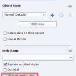
Show the setup of the two fluid boxes 108 & 109. Keep the vertical size of the first to what you need (15%?) and set the second one to the rest vertically. Also check if the inserted text container (shape or caption) is not locking the width/height ratio. It is labeled ‘Maintain aspect ratio’ in the Properties panel for the Text container. Uncheck that option.


