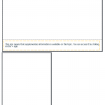
I’m creating a responsive project and having trouble keeping text within a shape when the project re-sizes. I started with a text caption and added text. Next, I put a shape around the text and adjusted the stroke. The image looks fine at desktop size, but the two items don’t remain together when I view the slide at a smaller size such as for an iPhone X. How do I keep the two connected
and scaling together so the shape stays around the text? 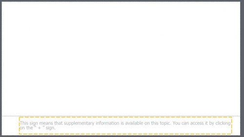
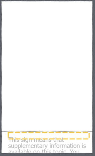
The fluid boxes were not part of the project originally; I added those in an attempt to force the items in the fluid boxes to stay together.
I’m creating a responsive project and having trouble keeping text within a shape when the project re-sizes. I started with a text caption and added text. Next, I put a shape around the text and adjusted the stroke. The image looks fine at desktop size, but the two items don’t remain together when I view the slide at a smaller size such as for an iPhone X. How do I keep the two connected
and scaling together so the shape stays around the text? 

The fluid boxes were not part of the project originally; I added those in an attempt to force the items in the fluid boxes to stay together.
You must be logged in to post a comment.
- Most Recent
- Most Relevant
keythrew, I tried to re-create your layout and follow what Lieve explained and it works. I did have to re-adjust the left side padding by 10 to get it to look nice and centered. Once I did that it worked every time I chose a different screen size. Good luck.


